
KINTOテクノロジーズ の技術ブログ
全1123件
この記事は KINTOテクノロジーズアドベントカレンダー2025 の10日目の記事です🎅🎄 目次 はじめに この記事の要約 作ったもの 特徴 前提条件 運用上の工夫 アーキテクチャ 実装のポイント 使い方 導入効果 まとめ はじめに こんにちは。KINTOテクノロジーズの共通サービス開発グループのエンジニア、宮下です。 AWSなどを使う現在の開発環境は、簡単に増やしたり減らしたりできる反面、環境の数が増えていきがちです。 我々の開発環境も、dev、dev2、stg、stg2...stg5、ins、prodのように、とても多くなってしまっています。 そのため、 AWS Systems Manager Parameter Store で管理する値も、環境数 × パラメータ数の組み合わせでどんどん増えていき、ケアレスミスが多発していました。 例えば以下のようなミスです。 devのParameter Storeは最新化したけれど、stgのパラメータを更新し忘れていた KEY, VALUEは正しいけれど、タグを入れ忘れていた デプロイに失敗するので調査したら、新規追加のパラメータを登録し忘れていたのが原因だった devからstgへ手作業でコピペする際、環境ごとに変えるべき値をそのままコピペしてしまった また、現在のParameter Storeの値がどうなっているかも分かりづらく、ブラウザでいちいち各環境に入って確認するのが面倒で、つい後回しになりがちでした。その結果、よりケアレスミスが起きる悪循環に陥っていました。 そこで、「ローカルのYAMLファイルに各環境のパラメータを集約し、そのファイルとAWSを同期する」という方針で自動化の仕組みを作りました。今回はそのアイデアを紹介します。 :::message 本記事では説明を簡潔にするために、代表として dev / stg / prod の3環境を例に説明します。 実際の現場ではこの他に dev2, stg2〜stg5, inte, ins, prodなど、さらに多くの環境があります。 ::: この記事の要約 10環境以上 × 50以上のパラメータ のAWS Parameter Store管理が煩雑すぎたので自動化した YAMLで全パラメータを可視化 + GitHub Actionsでワンクリック同期 更新漏れやケアレスミスをゼロにし、面倒くさい機械的なコピペ作業を無くした 作ったもの 以下の3つを組み合わせてこの仕組みを構築しました: YAMLファイル - 全環境のParameter Storeの値を一元管理 Pythonスクリプト - YAMLとAWS間の同期処理 GitHub Actions - ワンクリックで全環境に反映 特徴 1. YAML可視化 従来は各環境のParameter Storeの値を確認するために、AWSコンソールに各環境ごとにアカウントを切り替えて何度もログインする必要がありました。 今は、リポジトリにある1つのYAMLファイルを開けば、全環境の全パラメータが一覧できます。 parameters: # 環境ごとに値が異なるパラメータ - key: api/endpoint description: "APIエンドポイント" environment_values: dev: "https://dev-api.example.com" stg: "https://stg-api.example.com" prod: "https://prod-api.example.com" # 全環境で共通の値 - key: app/timeout description: "タイムアウト設定(秒)" default_value: "30" # 機密情報(SecureString) # 値はGitHub Secretsから環境変数経由で取得(例: SSM__DB__PASSWORD) - key: db/password description: "データベースパスワード" type: "SecureString" メリット: どの環境でどの値を使っているか一目瞭然 Git管理できるので変更履歴も追える PRレビューで値の間違いを事前に防げる 2. ワンクリック同期 GitHub Actions のワークフローを手動実行するだけで、全環境のParameter Storeが自動的にYAMLの内容と同期されます。 マトリクス・ストラテジー により、複数環境(dev, stg, prod)が並列で実行されるため、環境が増えても実行時間はほぼ変わりません。 AWSコンソールで環境を切り替えながらポチポチする必要がなくなりました。 前提条件 この仕組みは以下の前提で動作します。 AWS CLI がGitHub Actionsランナー上で利用できること Parameter Storeへの ssm:GetParametersByPath , ssm:PutParameter , ssm:AddTagsToResource 権限があること GitHub ActionsからAWSにアクセスできること(Access Keyもしくは OIDC など) Python 3.11 + pyyaml が利用できること :::message 本記事では簡略化のためにIAMユーザーのアクセスキーを使用していますが、本番運用ではセキュリティ向上のため OIDC (OpenID Connect) を使用したキーレス認証を推奨します。 ::: 運用上の工夫 自動化で便利になる一方、誤操作のリスクも考慮が必要です。我々のチームでは以下の工夫をしています。 SecureStringの操作権限を絞る GitHub Secretsを編集できる人を限定し、機密情報を扱える人を最小限にしています。 本番環境への反映はワークフローを分けて承認制に 本番環境のParameter Store更新時は、本番環境専用のワークフローを使い、ワークフローの中でSlackで承認ステップを挟む運用にしています。承認依頼時には更新対象のパラメータ一覧がSlackに表示されるため、「何が変わるのか」を確認してから承認できます。これにより、うっかり本番を更新してしまう事故を防いでいます。 アーキテクチャ graph TB YAML["aws-params.yml"] Secrets["GitHub Secrets (per env)"] subgraph GHA["GitHub Actions"] Workflow["3環境並列実行"] end subgraph Scripts["Python"] Update["update_aws_params.py"] end subgraph AWS["AWS Parameter Store"] dev["/dev/app/config/"] stg["/stg/app/config/"] prod["/prod/app/config/"] end YAML --> Workflow Secrets --> Workflow Workflow --> Update Update --> dev Update --> stg Update --> prod style YAML fill:#e1f5ff style Secrets fill:#fff0f0 style GHA fill:#fff4e1 style Scripts fill:#f0ffe1 style AWS fill:#ffe1e1 実装のポイント ディレクトリ構成 $ tree .github .github ├── aws-params.yml ├── scripts │ ├── aws_param_common.py │ └── update_aws_params.py └── workflows └── sync-parameters.yml YAML設計 全環境のパラメータを .github/aws-params.yml に集約しています(YAMLの例は「特徴」セクションを参照)。 SecureStringの扱い DBのパスワードなどの機密情報をYAMLにベタ書きするのはセキュリティ上NGです。 そこで、 「YAMLにはキーの定義のみ」「実体(値)はGitHub Secrets」 という役割分担を行いました。 Pythonスクリプト側で、YAMLの定義を見て type: SecureString ならば、対応する環境変数を読みに行く設計にしています。 命名規則: YAMLのkey: db/password → 環境変数名: SSM__DB__PASSWORD 環境ごとにSecureStringの値を分ける DBパスワードなどは環境ごとに異なる値を使うことが多いです。GitHub Actionsの Environments 機能を使えば、環境ごとに異なるSecretsを設定できます。 設定手順: GitHubリポジトリの Settings → Environments で環境を作成( dev , stg , prod ) 各環境のSecretsに SSM__DB__PASSWORD などを登録(値は環境ごとに異なる) ワークフローで environment: ${{ matrix.env }} を指定 これにより、DEV環境ではDEV用のDBパスワード、STG環境ではSTG用のDBパスワードが自動的に使われます。 補足:Parameter Store vs Secrets Manager 「機密情報なら Secrets Manager では?」と思う方もいるかもしれません。使い分けの目安は以下の通りです: Parameter Store (SecureString) Secrets Manager 料金 標準パラメータは無料 $0.40/シークレット/月 ローテーション 手動 自動ローテーション可能 向いているケース APIキーなど更新頻度が低いもの DBパスワードの自動ローテーションが必要な場合 多くのケースではParameter Store(SecureString)で十分で、Secrets Managerは「RDSパスワードの自動ローテーション」が必要な場合に検討してください。 :::message 補足:Secrets Managerの値も同様に管理できます。 cmd = [ "aws", "secretsmanager", "put-secret-value", "--secret-id", secret_id, "--secret-string", value ] subprocess.run(cmd, check=True) ::: Pythonスクリプト構成 aws_param_common.py - 共通機能 #!/usr/bin/env python3 """AWS Parameter Store 共通処理""" import os import sys import json import subprocess from typing import Dict, Any, Tuple import yaml def get_env_name() -> str: """環境名を取得""" env = os.environ.get("ENV_NAME") if not env: print("エラー: ENV_NAME 環境変数が設定されていません") sys.exit(1) return env def get_prefix(env: str) -> str: """環境に応じたプレフィックスを返す""" return f"/{env}/app/config/" def load_yaml_config() -> Tuple[Dict[str, Any], set]: """YAMLファイルを読み込む""" yaml_path = os.path.join(os.path.dirname(__file__), "..", "aws-params.yml") with open(yaml_path, "r", encoding="utf-8") as f: config = yaml.safe_load(f) yaml_keys = {param["key"] for param in config.get("parameters", [])} return config, yaml_keys def get_existing_params(env: str) -> Dict[str, Dict[str, Any]]: """AWS SSMから既存のパラメータを取得(ページネーション対応)""" prefix = get_prefix(env) existing_params = {} next_token = None while True: cmd = [ "aws", "ssm", "get-parameters-by-path", "--path", prefix, "--recursive", "--with-decryption", "--output", "json" ] if next_token: cmd.extend(["--next-token", next_token]) try: result = subprocess.run(cmd, check=True, capture_output=True, text=True) data = json.loads(result.stdout) params_data = data.get("Parameters", []) except subprocess.CalledProcessError as e: print(f"警告: パラメータの取得に失敗しました: {e.stderr}") return {} for param in params_data: key = param["Name"].replace(prefix, "") existing_params[key] = { "value": param["Value"], "type": param["Type"], "version": param.get("Version", 1) } next_token = data.get("NextToken") if not next_token: break return existing_params def get_param_value(param: Dict[str, Any], env: str) -> str | None: """パラメータの値を取得(SecureStringは環境変数、それ以外はYAMLの値を使用)""" # SecureStringの場合は環境変数から取得 if param.get("type") == "SecureString": env_var_name = "SSM__" + param["key"].upper().replace("/", "__") value = os.environ.get(env_var_name) if not value: print(f"警告: SecureString {param['key']} の環境変数 {env_var_name} が未設定") return None return value # 環境固有の値 env_values = param.get("environment_values", {}) if env in env_values: return str(env_values[env]) # デフォルト値 if "default_value" in param: return str(param["default_value"]) return None def validate_param(param: Dict[str, Any], env: str) -> Tuple[bool, str, Dict[str, Any] | None]: """パラメータのバリデーション""" key = param.get("key") if not key: return False, "keyが定義されていません", None value = get_param_value(param, env) if value is None: return False, f"{key}: 環境 {env} の値が定義されていません", None param_info = { "key": key, "value": value, "type": param.get("type", "String"), "description": param.get("description", "") } return True, "", param_info def update_parameter(param_info: Dict[str, Any], env: str) -> bool: """パラメータを更新""" prefix = get_prefix(env) full_name = prefix + param_info["key"] cmd = [ "aws", "ssm", "put-parameter", "--name", full_name, "--value", param_info["value"], "--type", param_info["type"], "--overwrite" ] if param_info.get("description"): cmd.extend(["--description", param_info["description"]]) try: subprocess.run(cmd, check=True, capture_output=True, text=True) add_tags(full_name, env) # タグを追加 return True except subprocess.CalledProcessError as e: print(f"エラー: {param_info['key']} の更新に失敗: {e.stderr}") return False def add_tags(parameter_name: str, env: str) -> bool: """パラメータにタグを追加""" cmd = [ "aws", "ssm", "add-tags-to-resource", "--resource-type", "Parameter", "--resource-id", parameter_name, "--tags", f"Key=Environment,Value={env}", "Key=SID,Value=backend-api" ] try: subprocess.run(cmd, check=True, capture_output=True, text=True) return True except subprocess.CalledProcessError as e: print(f"警告: タグの追加に失敗: {e.stderr}") return False ポイント: get_existing_params : ページネーション対応で50件以上のパラメータも取得可能 get_param_value : SecureStringは環境変数から、通常パラメータはYAMLから値を取得 update_parameter : パラメータ更新後に add_tags を呼び出してタグを付与 タグについて パラメータ作成時に、自動でタグを付与します。タグはAWSコンソールでの検索やコスト管理に便利なだけでなく、システムによってはタグがないとパラメータを読み込めない場合もあります。 タグ 値 説明 Environment dev , stg , prod 実行時の環境名が自動で入る SID backend-api サービス識別子(自分のサービス名に置き換えて使用) update_aws_params.py - 更新スクリプト #!/usr/bin/env python3 """AWS Parameter Store 更新スクリプト""" import sys import aws_param_common as common def update_parameters(): """パラメータを更新し、結果をレポートする""" env = common.get_env_name() print(f"=== 環境: {env} ===") print(f"プレフィックス: {common.get_prefix(env)}") print() config, yaml_keys = common.load_yaml_config() existing_params = common.get_existing_params(env) print(f"既存パラメータ数: {len(existing_params)}") print() updated_params = [] skipped_params = [] failed_params = [] for param in config.get("parameters", []): is_valid, error_msg, param_info = common.validate_param(param, env) if not is_valid: print(f"[スキップ] {error_msg}") continue param_key = param_info["key"] value = param_info["value"] # 既存の値と比較 if param_key in existing_params: if existing_params[param_key]["value"] == value: print(f"[スキップ] {param_key}: 値に変更なし") skipped_params.append(param_key) continue print(f"[更新] {param_key}: 値を更新します") else: print(f"[新規] {param_key}: 新規パラメータを追加します") # パラメータを更新 success = common.update_parameter(param_info, env) if success: updated_params.append(param_key) print(f" ✓ 完了") else: failed_params.append(param_key) print(f" ✗ 失敗") # 結果サマリー print() print("=== 結果サマリー ===") print(f"更新: {len(updated_params)} 件") print(f"スキップ(変更なし): {len(skipped_params)} 件") print(f"失敗: {len(failed_params)} 件") if failed_params: print() print("失敗したパラメータ:") for key in failed_params: print(f" - {key}") sys.exit(1) print() print("✓ 正常終了") if __name__ == "__main__": update_parameters() ポイント: 値が変わっていないパラメータはスキップ(無駄な更新を防ぐ) 更新結果を統計情報として出力 失敗時は終了コード1で終了 GitHub Actionsワークフロー name: Sync AWS Parameter Store on: workflow_dispatch: # 手動実行 jobs: sync-parameters: runs-on: ubuntu-latest strategy: matrix: env: [dev, stg, prod] environment: ${{ matrix.env }} # 環境ごとのSecretsを使用 steps: - name: Checkout repository uses: actions/checkout@v4 - name: Setup Python uses: actions/setup-python@v5 with: python-version: '3.11' - name: Install dependencies run: pip install pyyaml - name: Configure AWS Credentials uses: aws-actions/configure-aws-credentials@v4 with: aws-access-key-id: ${{ secrets.AWS_ACCESS_KEY_ID }} aws-secret-access-key: ${{ secrets.AWS_SECRET_ACCESS_KEY }} aws-region: ap-northeast-1 - name: Sync Parameters env: ENV_NAME: ${{ matrix.env }} # SecureString用(環境ごとのGitHub Secretsから取得) SSM__DB__PASSWORD: ${{ secrets.SSM__DB__PASSWORD }} SSM__API__SECRET_KEY: ${{ secrets.SSM__API__SECRET_KEY }} run: | cd .github/scripts python update_aws_params.py ポイント: strategy.matrix で複数環境を並列実行 environment: ${{ matrix.env }} で環境ごとのSecretsを使用(devとprodで異なるDBパスワードなど) SecureStringの値は環境変数経由でスクリプトに渡す 値に変更がないパラメータは自動的にスキップされる 使い方 1. パラメータの追加・変更 .github/aws-params.yml を編集してPRを出すだけです。 parameters: # 新しいパラメータを追加 - key: feature/enable_payment_v2 description: "新決済システムの有効化" environment_values: dev: "true" stg: "false" prod: "false" 2. 全環境への反映 GitHub Actionsページを開く Sync AWS Parameter Store を選択 Run workflow ボタンをクリック 全環境に並列で反映される 3. SecureStringパラメータの追加 YAMLに定義を追加: - key: payment/api_key description: "決済APIキー" type: "SecureString" GitHub Environmentsに値を登録: Settings → Environments → 各環境(dev, stg, prod)のSecretsに登録 Secret名: SSM__PAYMENT__API_KEY 値: (環境ごとに異なる実際の値) ワークフローファイルの環境変数セクションに追加: env: SSM__PAYMENT__API_KEY: ${{ secrets.SSM__PAYMENT__API_KEY }} 4. 実演 GitHub Actions画面から今回作ったアクションを選んで、起動します。 アクションが正常終了したことを確認します。各環境が並列で動作した事がわかります。 AWSのパラメータストア画面を開いて確認してみます。パラメータが登録されています。成功です。 導入効果 具体的な効果 作業時間 : 環境数 × 5分 → ワンクリック (10環境なら50分削減) 更新漏れ : 月数回発生 → ゼロ 確認作業 : AWSコンソールを開く → YAMLを見るだけ まとめ クラウド時代の「環境が増えすぎ問題」は、多くの現場で直面している課題だと思います。 今回紹介したアイデアのポイントは: YAML可視化 - 全環境のパラメータを1ファイルで管理 ワンクリック同期 - GitHub Actionsで自動反映 SecureString対応 - 機密情報も安全に管理 特別な技術は使っておらず、 GitHub Actions + Python + AWS CLI だけで実現できます。 Parameter Storeの管理で困っている方、環境が増えて運用が大変になっている方の参考になれば幸いです。 最後までお読みいただき、ありがとうございました🙇♂️

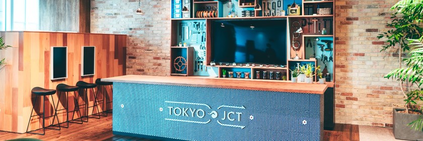
こんにちは! 人事企画G 労務・総務チームのつんつんです。 構想から約1年。何もないガランとした空間だった場所が、ついに「働きたくなるオフィス」へと生まれ変わりました。 今回は、写真や動画だけでは伝えきれない、私たちの「こだわり」と「熱量」を詰め込んだ福岡の新オフィスツアーへご案内します。壁紙一枚、椅子一脚にまでストーリーがあるんですよ。 1. 幸せが溢れてくるエントランス まず皆様をお迎えするのは、ガラス張りの視界が良い緑豊かなエントランスです。 ただ鉢植えを置くだけでは面白くないですよね。そこで、あえて段差をつけて植物を配置し、空間に「枠」を作りました。 こうすることで、外からも中からも緑が映え、空間がキュッと締まって見えるんです。まさに「一石二鳥」のアイデア。 「幸せが溢れてくる入り口」 ――手前味噌ですが、そんな表現がぴったりの空間になりました。 2. 大人心をくすぐる「港」のラウンジとカウンター 福岡といえば「港」。ラウンジエリアのテーマはずばり「Port(港)」です。 ここで絶対に見てほしいのが、壁面のデザイン。これ、住宅の外壁などに使われる**「ガルバリウム」**という本物の建材を使っているんです。 実はこれ、ただの飾りじゃありません。このコンテナロックはガラガラと動かすことができるんです。 またカウンター奥には ハンドドリップでコーヒーを淹れたり、業務終了後にはバーカウンターのように使ってイベントを行ったりすることも想定しています。 裏 表 また休憩エリアの照明には船舶風のマリンランプや、ガラスの浮き球を模した照明を吊るし、船内のような温かみのある雰囲気を演出しています。細部まで「港」を感じさせる、大人心をくすぐる空間です。 3. 「WE BUILD BRIDGES」:絶景のラウンジエリア 窓際は、このオフィス一番の特等席です。 目の前には天神の街と橋が広がり、開放感は抜群。この壁には大きく 「WE BUILD BRIDGES」 のアートワークを施しました。福岡で有名な荒津大橋からヒントを得て拠点長が各拠点がつながるようにという想いをこめて社内のクリエイティブが作成しました。 また港方面には椅子を置かず、「スタンディングエリア」にしています。 海を眺めながら仕事するとアイデアが浮かんでくるかもですね。 夕方 夜 夜は夜景が綺麗でしてまた違った雰囲気を出しております〜 ふと視線を上げれば、窓の外に荒津大橋が見えます。(昼間の写真) 煮詰まった時にここに来て、外を眺めながら立って議論すれば、新しいアイデアの架け橋がかかるかもしれません。もちろん、電源も完備しているので集中作業もバッチリですよ。 4. 会議室エリア 執務・会議室エリアは、雰囲気をガラッと変えて大阪オフィスとはまた違う、落ち着いた大人の雰囲気です。 会議室の番号フォント、少し変わっていると思いませんか? 実はこれ、ステンシルフォントのデザインフォントを採用しているんです。IT企業らしい遊び心をこっそり忍ばせています。 会議室4つの内3つはあえて「キャスター(タイヤ)がない」モデルを選びました。 不便そうですか? いえいえ、キャスターがないと席を立った時に椅子が散らばらず、元に戻そうと心理が働き常に整然と元の位置に戻るんです。美しい空間を保つための、私たちの美学であり、こだわりポイントです。 また青色の壁はOsaka Tech Labと同じ青を使うことにより、西日本の一体感を創出してます。 5. 見えない場所にこそ「愛」を 最後に、こっそりお見せするのが、特注のベンチソファの下です。 座面をパカッと開けると、そこには災害用備蓄品が入っています。 おしゃれなデザインの裏側に、社員の安全を守る備えもしっかり隠しています。「何かあった時でも、ここなら安心」と思える場所にしたかったんです。 おわりに:こだわり抜いた「柱」の話 実はこのオフィスを作る際、柱のタイル装飾だけに予算をかけるか非常に悩みましたそれでも、「空間の空気感を変えるためには必要」と感じました。タイルを貼らなくても場所としては成立しますが、気持ちよく仕事をしてほしい・・・私たちのそんな想いが詰まっています。また本棚と一緒にすることによりスペースを有効活用しました。 コーヒーの香り、コンテナ扉の重厚感、そして窓からの素晴らしい眺め。 ぜひ一度、遊びに来てください。このこだわりの場所で、皆様とお会いできるのを楽しみにしています! 今後もオフィスの改善活動を続けていきますので、Tech Blogでの報告を楽しみにしていてくださいね。
This article is for Day 9 of the KINTO Technologies Advent Calendar 2025 🎅🎄 Introduction Hello. I'm Katsutoshi Tsuji, and I joined KINTO Technologies in November. I'm an engineer who has worked in the digital accessibility field for over 20 years, and I have been completely blind since birth. In this article, I'll share why I, a visually impaired person, chose to join KINTO Technologies, a company specializing in mobility, and what kind of future I'm working toward. This might sound like a futuristic dream, but please stick with me to the end. The Challenges of Mobility for Visually Impaired People I was born in Sasebo City, Nagasaki Prefecture. Nagasaki is known as a city of hills. Buses were more common than trains, but my home was far from the bus stop, making it unrealistic for a visually impaired person to live independently. When I was a child, every household had a car, and transportation centered around driving. The only way I could get around was to have my family drive me. When I moved to Tokyo about 30 years ago, I remember being moved by the realization that once I memorized the route to the station, I could travel freely by train. That's how much my life in the countryside lacked freedom of movement. The place where I currently live is also far from the station, which is inconvenient for visually impaired people. However, working remotely while listening to the birds singing outside my window is a very pleasant lifestyle. Some of my visually impaired acquaintances worry that it might be inconvenient, but after living here for three years, I haven't experienced any major difficulties in daily life. My Dream of Autonomous Driving How interested are you in autonomous driving? Since I moved here, I have found myself increasingly fascinated by autonomous driving and the possibility it offers: the freedom to move on my own terms. For me, as a visually impaired person, autonomous driving is more than just technology. It is a dream of reclaiming freedom of mobility. A Video of an Autonomous Taxi Sparked My Interest The first time I saw a visually impaired person riding in an autonomous vehicle was in a video released by Google in 2012. At the time, I was skeptical, wondering if it could really become a reality. https://www.youtube.com/watch?v=cdgQpa1pUUE However, in 2024, I was amazed when I saw a video of a visually impaired person riding in an autonomous taxi. The system allows passengers to operate their smartphone and locate the vehicle by the sound of its horn. What's more, it was actually running on public roads in the United States. At that moment, I strongly felt that I wanted to try it myself. https://www.youtube.com/watch?v=4OPiC-zXtJk&list=PLzaPe49p32aZ7SPFDhvgJV-cOpskQ5VYu&index=7 I thought, at KINTO Technologies, I might be able to get involved with autonomous driving technology. Someday, I want to work on projects related to autonomous driving. This is why I decided to work at a mobility company. I want to leverage the accessibility knowledge I've built over the years to contribute to mobility for visually impaired people. What I Aim to Achieve at KINTO Technologies Even if we aim for a future where autonomous vehicles become commonplace for visually impaired people, it won't happen immediately. For most people, visually impaired person and car are probably the most unlikely combination. As I mentioned earlier, you can probably imagine a visually impaired person being driven somewhere by someone else, but it's harder to imagine them getting into a car alone and traveling to their destination, right? However, this need definitely exists, and especially visually impaired people living in rural areas dream of a future where they can go wherever they want, whenever they want, by themselves. While public transportation can get you close to your destination, finding and navigating to the actual location from there is not easy. For example, even if you use pedestrian GPS navigation to travel, as you approach your destination, the navigation ends with a message like "You are approaching your destination." Those few meters from there can be a huge hurdle for visually impaired people who cannot see. In this way, if we replace "car" with "mobility" in the context of visually impaired individuals, everyone can easily understand that the freedom to get around is essential for achieving one's goals. To create a future where autonomous vehicles become a key means of mobility, I will work on the following. 1. Making Accessibility the Norm in the Organization In the mobility industry, the importance of accessibility is not yet fully recognized. I will engage in careful dialogue within the company to explore together: Why accessibility is necessary What teams should start with What goals we should aim for By working alongside everyone and showing them the needs of users who may not have been considered before, what inconveniences they experience, and how they solve problems, my goal for the first year is to build an organization where people don't see accessibility as someone else's problem. As a result, I hope that the accessibility of various initiatives undertaken by KINTO Technologies will improve, reach new users, eventually become a value for the organization, and lead to efforts that change society. 2. Creating an Organization Where People with Disabilities Want to Continue Working Companies with 50 or more employees are required to hire people with disabilities, but in reality, some say, I don't know how to interact with them, or I can't imagine what kind of work to assign them. There are many cases where employees are only given standardized tasks and become isolated within the company. I am not the only employee with a disability at KINTO Technologies. My role is to demonstrate how people with disabilities contribute to the organization, and to foster an environment where we can work together as colleagues toward our company's goals. And I want to create an organization where we can truly say, "I want to keep working here." I will maximize the value that can only be changed from inside the organization and contribute to the growth of KINTO Technologies. Conclusion For visually impaired people, freedom of movement has the power to change lives. At KINTO Technologies, I will take on the challenge of bringing that future closer to reality. If anyone resonates with this initiative, I would love to think about the future of mobility together.
Introduction Hello, and thank you for reading! I'm Nakamoto, a frontend developer at KINTO FACTORY . This time, rather than discussing technical topics, I'd like to share my experience taking paternity leave when my son was born in August this year. I'll cover the handover process at the team level and my thoughts after returning to work. Consulting with My Manager In April of this year, I was assigned as the team leader for the frontend team within the FACTORY E-commerce Development Group. At first, I felt a bit hesitant about being away from work for an extended period, but when I consulted with my manager, he wholeheartedly encouraged me to take paternity leave. I was told that the first few months after birth are particularly demanding for mothers, both physically and mentally, so I should try to support my wife as much as possible. So I applied for about two months of paternity leave, with the plan to reassess after one month whether I could return early. Handover Items Now, when it came to handing over my daily responsibilities, in addition to my regular frontend development work, as team leader I handled: Reviewing architecture for new projects, making directional decisions, and coordinating with related departments 1-on-1 meetings with each team member Semi-annual reviews and evaluations with each team member Recruiting activities Let me go into detail on each of these. Reviewing architecture for new projects, making directional decisions, and coordinating with related departments After regularly checking the roadmap with the PdMs and my manager for late August when my leave was scheduled to start, it turned out there weren't any major new projects coming up and most were already in progress. So I started documenting the projects I had been handling in Confluence, making it a habit to briefly summarize things like "who I discussed this with and what was decided" and "what I've completed so far." 1-on-1 meetings with each team member Semi-annual reviews and evaluations with each team member Next was the management area. One of my missions as team leader was to review and evaluate each team member's progress on a semi-annual basis. That review period was going to overlap directly with my leave period, so from the start of the April term, I had each team member set their goals in advance to make the reviews go smoothly. In practice, each member would record their goals and write monthly updates in Confluence about "what they accomplished and what they plan to do next month," which served as discussion topics for our 1-on-1s. I also made notes in that same Confluence page about things I noticed and the efforts I appreciated, so I could provide feedback during reviews. Since I was planning to take leave around the time of the birth, I figured that if my leave overlapped with the evaluation period, I could simply hand over that Confluence page to my manager, allowing him to quickly review each member's goals and achievements. Recruiting activities For this, I basically asked my manager to take over. However, I wanted the development team members to get a sense of candidates' technical skills and communication abilities from the interview stage, so I had them join interviews to check on communication and technical skills at the team level. During My Leave With most of the handover preparations in place, on August 24th, our healthy baby boy was born! I took three days of special leave, going back and forth between local government offices and the hospital. On the day before my paternity leave officially started, I went to the office just once to return my company equipment (PC, phone, employee badge, etc.). From there, for about two months, I stepped back from work and fully committed to taking care of my baby! Childcare Is Tough The FACTORY E-commerce Development Group has plenty of experienced dads, and before the birth I'd heard all kinds of stories, but as expected, the first month was really hard. My wife and I split childcare and sleep into half-day shifts and I handled childcare from morning until night. My wife suggested this approach, saying it would help me maintain my sleep cycle for when I returned to work, so I was basically up during the day and sleeping at night. With feeding, diaper changes, soothing the baby, and bath time coming at me almost by the minute, I barely had any time to think about myself. I don’t think work even crossed my mind at all during the first week or two. Still, the Service Is on My Mind About a month into my leave, I was able to talk with my manager and get updates on project progress and the team's status. After a month of hardly going out and barely talking to anyone, it felt like a huge mental reset. Also, by this point I'd gotten quite used to childcare, and my son was settling into longer sleep periods, so I remember occasionally checking on service updates. KINTO FACTORY releases new products and features on Wednesdays, so every Wednesday I'd visit the site to see "what's new this month?" The Return And so, after 65 days of paternity leave, I returned to work in November. There weren't any major changes to the group members, and some ongoing projects had been pushed back. Overall things hadn't changed dramatically from before my leave, so I was able to return smoothly. However, since my wife suddenly had to handle childcare solo during the day, I try to reduce her burden by going to work as early as possible in the morning and coming home as early as possible in the evening. This is made possible by our full-flex system. As long as I coordinate meetings and get agreement from the team, I can freely adjust my working hours. Conclusion By dedicating myself to childcare during the first two months, I was able to witness my son’s growth up close, from his very first smiles to his little coos and all the small changes he made day by day. Being so involved during this period felt like an incredibly precious experience. I was only able to have this experience because my manager and everyone in the group warmly sent me off on paternity leave. I'd like to take this opportunity to express my gratitude. At KINTO Technologies, I believe it's an environment where men can take paternity leave without difficulty. In fact, I've heard that many male engineers across different divisions have taken paternity leave just this year alone (there are many kids the same age as my son in the company!). I hope this is helpful for anyone preparing to take paternity leave or getting ready to return to work. Also, the article below introduces a day in the life of an experienced dad in the same FACTORY E-commerce Development Group, so please check that out too! A Must-Read for Parent Engineers! A Day in the Life of a KTC Dad Engineer
この記事は KINTOテクノロジーズ Advent Calendar 2025 の9日目の記事です🎅🎄 初めに こんにちは。11月に KINTOテクノロジーズ に入社した辻勝利です。 私は20年以上、デジタルアクセシビリティの分野で働いてきたエンジニアで、生まれたときから全盲の視覚障害者です。 この記事では、なぜ視覚障害者の私がモビリティを専門とするKINTOテクノロジーズに転職したのか、そして今後どんな未来を目指しているのかをお話しします。少し未来を見据えた、夢のような話になるかもしれませんが、ぜひ最後までお付き合いください。 視覚障害者と「移動」の課題 私は長崎県佐世保市で生まれました。長崎といえば坂の町。電車よりもバスが普及していましたが、私の家はバス停からも距離があり、視覚障害者が独力で日常生活を送るのは現実的ではありませんでした。 子供のころ、各家庭には自家用車があり、移動は車が中心。私が移動するには、家族に車を運転してもらうしかありませんでした。 30年ほど前に上京したとき、駅までの道を覚えれば電車で自由に移動できることに感動したのを覚えています。それほど、地方での生活は私にとって「移動の自由」がないものでした。 今住んでいる場所も駅から遠く、視覚障害者には不便な環境です。しかし、リモートワークで仕事をしながら、窓から聞こえる鳥の声に耳を傾ける生活はとても心地よいものです。視覚障害者の知人からは「不便ではないか」と心配されますが、3年住んでみて、日常生活に大きな不便は感じていません。 自動運転への憧れ 皆さんは「車の自動運転」にどれくらい興味がありますか? 私はこの場所に引っ越してから、自分の意思で自由に移動できる可能性を秘めた自動運転に強く惹かれるようになりました。視覚障害者である私にとって、自動運転は単なる技術ではなく、「移動の自由」を取り戻す夢です。 きっかけは自動運転タクシーの動画 初めて視覚障害者が自動運転車に乗る様子を見たのは、2012年にGoogleが公開した動画でした。当時は「本当に実現できるのだろうか?」と半信半疑でした。 https://www.youtube.com/watch?v=cdgQpa1pUUE しかし2024年、自動運転タクシーに視覚障害者が乗車する動画を見て驚きました。スマートフォンを操作し、クラクションの音で車の位置を確認して乗車する仕組み。しかも、アメリカの公道で実際に走っているのです。 この瞬間、「自分も試してみたい」と強く思いました。 https://www.youtube.com/watch?v=4OPiC-zXtJk&list=PLzaPe49p32aZ7SPFDhvgJV-cOpskQ5VYu&index=7 「KINTOテクノロジーズであれば、自動運転の技術にかかわることができるかもしれない。いつかは自分も自動運転にかかわれるような仕事がしたい。」 これが、私がモビリティカンパニーで働きたいと考えたきっかけです。長年培ったアクセシビリティの知識を活かし、視覚障害者の移動に貢献したいと考えています。 KINTOテクノロジーズで目指すこと 自動運転車が視覚障害者にとって当たり前になる未来を目指すとしても、すぐに実現できるわけではありません。多くの人にとって「視覚障害者」と「車」は最も縁遠い組み合わせでしょう。 前述のように、視覚障害者が誰かに車を運転してもらって目的地に行くことは想像できますが、単独で車に乗車して目的地まで行くことはあまり想像できないのではないでしょうか? しかし、このようなニーズは確かにあって、特に地方で暮らす視覚障害者は自分だけで行きたいところにいつでも出かけられるような未来を夢見ています。 公共交通機関を利用すれば目的地の近くまで移動することはできますが、そこから目的地を探して移動することは容易ではありません。 例えば、歩行者用のGPSナビゲーションを使って移動したとしても、目的地が近づくと「まもなく目的地付近です」という案内とともにナビゲーションは終了してしまいます。 そこからのほんの数メートルが、見ることのできない視覚障害者にとっては大きなハードルとなることがあるのです。 このように、「視覚障害者」と「移動」に置き換えれば、目的を達成するために移動することは誰もが容易に理解できるかと思います。その手段が「自動運転車」になる未来を作るために、私は次のことに取り組みます。 1. アクセシビリティを組織の当たり前にする モビリティ業界では、アクセシビリティの重要性はまだ十分に認識されていません。私は社内で丁寧に対話し、 なぜアクセシビリティが必要なのか チームで何から始めるべきか どんなゴールを目指すのか を一緒に考えていきます。 皆さんとともに活動し、これまで想定されていなかったかもしれないユーザーのニーズや、どんなことに不便を感じたり、どんなふうに課題を解決しているのかを見ていただくことで、「アクセシビリティは自分たちには関係ない」と思われない組織にすること。それが最初の1年の目標です。 その結果、KINTOテクノロジーズが取り組む様々な活動のアクセシビリティが向上し、新たなユーザーにリーチできて、ゆくゆくはそれが組織の価値になり、社会を変えるような取り組みになればいいなと考えています。 2. 障害者が働き続けたい組織を作る 50人以上の企業には障害者雇用が義務付けられていますが、実際には「どう接すればいいかわからない」「どんな仕事を任せればいいのか想像できない」という声もあります。 定型化された仕事だけを任され、企業の中で孤立してしまうケースも少なくありません。 KINTOテクノロジーズには私のほかにも障害のある社員がいます。私の役割は、私たち障害者が組織で働く姿を見てもらい、同僚として共に会社の目標に向かって進める環境を作ることです。 そして、私たち自身が「ここで長く働き続けたい」といえるような組織を作っていきたいと思っています。 「組織の内側からしか変えられない価値」を最大化し、KINTOテクノロジーズの発展に貢献していきます。 最後に 視覚障害者にとって「移動の自由」は人生を変える力を持っています。私はKINTOテクノロジーズで、その未来を現実に近づけるために挑戦します。 この取り組みに共感していただける方がいれば、ぜひ一緒に「移動の未来」を考えていきましょう。
こんにちは! 人事企画G 労務・総務チームのつんつんです。 構想から約1年。何もないガランとした空間だった場所が、ついに「働きたくなるオフィス」へと生まれ変わりました。 今回は、写真や動画だけでは伝えきれない、私たちの「こだわり」と「熱量」を詰め込んだ福岡の新オフィスツアーへご案内します。壁紙一枚、椅子一脚にまでストーリーがあるんですよ。 1. 幸せが溢れてくるエントランス まず皆様をお迎えするのは、ガラス張りの視界が良い緑豊かなエントランスです。 ただ鉢植えを置くだけでは面白くないですよね。そこで、あえて段差をつけて植物を配置し、空間に「枠」を作りました。 こうすることで、外からも中からも緑が映え、空間がキュッと締まって見えるんです。まさに「一石二鳥」のアイデア。 「幸せが溢れてくる入り口」 ――手前味噌ですが、そんな表現がぴったりの空間になりました。 2. 大人心をくすぐる「港」のラウンジとカウンター 福岡といえば「港」。ラウンジエリアのテーマはずばり「Port(港)」です。 ここで絶対に見てほしいのが、壁面のデザイン。これ、住宅の外壁などに使われる**「ガルバリウム」**という本物の建材を使っているんです。 実はこれ、ただの飾りじゃありません。このコンテナロックはガラガラと動かすことができるんです。 またカウンター奥には ハンドドリップでコーヒーを淹れたり、業務終了後にはバーカウンターのように使ってイベントを行ったりすることも想定しています。 裏 表 また休憩エリアの照明には船舶風のマリンランプや、ガラスの浮き球を模した照明を吊るし、船内のような温かみのある雰囲気を演出しています。細部まで「港」を感じさせる、大人心をくすぐる空間です。 3. 「WE BUILD BRIDGES」:絶景のラウンジエリア 窓際は、このオフィス一番の特等席です。 目の前には天神の街と橋が広がり、開放感は抜群。この壁には大きく 「WE BUILD BRIDGES」 のアートワークを施しました。福岡で有名な荒津大橋からヒントを得て拠点長が各拠点がつながるようにという想いをこめて社内のクリエイティブが作成しました。 また港方面には椅子を置かず、「スタンディングエリア」にしています。 海を眺めながら仕事するとアイデアが浮かんでくるかもですね。 夕方 夜 夜は夜景が綺麗でしてまた違った雰囲気を出しております〜 ふと視線を上げれば、窓の外に荒津大橋が見えます。(昼間の写真) 煮詰まった時にここに来て、外を眺めながら立って議論すれば、新しいアイデアの架け橋がかかるかもしれません。もちろん、電源も完備しているので集中作業もバッチリですよ。 4. 会議室エリア 執務・会議室エリアは、雰囲気をガラッと変えて大阪オフィスとはまた違う、落ち着いた大人の雰囲気です。 会議室の番号フォント、少し変わっていると思いませんか? 実はこれ、ステンシルフォントのデザインフォントを採用しているんです。IT企業らしい遊び心をこっそり忍ばせています。 会議室4つの内3つはあえて「キャスター(タイヤ)がない」モデルを選びました。 不便そうですか? いえいえ、キャスターがないと席を立った時に椅子が散らばらず、元に戻そうと心理が働き常に整然と元の位置に戻るんです。美しい空間を保つための、私たちの美学であり、こだわりポイントです。 また青色の壁はOsaka Tech Labと同じ青を使うことにより、西日本の一体感を創出してます。 5. 見えない場所にこそ「愛」を 最後に、こっそりお見せするのが、特注のベンチソファの下です。 座面をパカッと開けると、そこには災害用備蓄品が入っています。 おしゃれなデザインの裏側に、社員の安全を守る備えもしっかり隠しています。「何かあった時でも、ここなら安心」と思える場所にしたかったんです。 おわりに:こだわり抜いた「柱」の話 実はこのオフィスを作る際、柱のタイル装飾だけに予算をかけるか非常に悩みましたそれでも、「空間の空気感を変えるためには必要」と感じました。タイルを貼らなくても場所としては成立しますが、気持ちよく仕事をしてほしい・・・私たちのそんな想いが詰まっています。また本棚と一緒にすることによりスペースを有効活用しました。 コーヒーの香り、コンテナ扉の重厚感、そして窓からの素晴らしい眺め。 ぜひ一度、遊びに来てください。このこだわりの場所で、皆様とお会いできるのを楽しみにしています! 今後もオフィスの改善活動を続けていきますので、Tech Blogでの報告を楽しみにしていてくださいね。
この記事は KINTOテクノロジーズ Advent Calendar 2025 の 8 日目の記事です🎅🎄 KINTOテクノロジーズのAndroidエンジニア 山田 剛 です。 本記事では、少しのコード追加・変更でJetpack Composeを利用したUIにアニメーションを追加し、アニメーションの印象を向上させるための事例集を紹介します。 1. はじめに スマートフォンアプリの印象を大きく左右する要素の一つがアニメーションです。適所に用意された気の利いたアニメーションは、ユーザーの操作に対する視覚的なフィードバックを提供し、アプリの動作の意味を理解しやすくするとともに、アプリの印象を向上させ、品質に対するユーザーの信頼感を増します。Jetpack Composeでは、「宣言的UI」の特性を活かした、従来のViewシステムよりも短く簡潔なコードで、生産性の高いアニメーションの実装が可能になっています。本記事では、その技術の中から、小規模なコードの追加・修正で既存のソースに容易にアニメーションを追加できる実用的なテクニックを紹介します。 本記事では、執筆時点での Compose Animation の最新の安定版 1.10.0 を含んだ Jetpack Compose Libraries BOM 2025.12.00 でソースコードを検証しています。 2. 座標を指定するタイプのUI部品のアニメーション 以下は簡単なパズルゲーム(15パズル)を短いコードで書いています: @Composable fun Puzzle15(modifier: Modifier = Modifier) { var puzzleState by remember { mutableStateOf(PuzzleState.generate()) } var moves by remember { mutableIntStateOf(puzzleState.moves) } val solved = puzzleState.isSolved() val titleStyle = MaterialTheme.typography.headlineLarge.merge(fontWeight = FontWeight.W600) val movesStyle = MaterialTheme.typography.titleMedium val solvedStyle = MaterialTheme.typography.titleLarge.merge(color = Color.Green, fontWeight = FontWeight.W600) val buttonStyle = MaterialTheme.typography.titleMedium.merge(fontWeight = FontWeight.W600) Box(modifier = Modifier.fillMaxWidth(), contentAlignment = Alignment.Center) { Column( modifier = modifier .fillMaxSize() .padding(16.dp), horizontalAlignment = Alignment.CenterHorizontally, verticalArrangement = Arrangement.Center ) { Text( text = "15 Puzzle", style = titleStyle, modifier = Modifier.padding(bottom = 16.dp) ) Text(text = "Moves: $moves", style = movesStyle) PuzzleGrid( puzzleState = puzzleState, modifier = Modifier.padding(vertical = 24.dp) ) { index -> if (solved) return@PuzzleGrid puzzleState.moveTile(index) moves = puzzleState.moves } Button(onClick = { puzzleState = PuzzleState.generate() moves = 0 }) { Text("New Game", style = buttonStyle) } } if (solved) { Text(text = "🎉 Solved! 🎉", style = solvedStyle) } } } 4x4 の升目に描く15枚のタイルは、以下のコードで表示しています: @Composable private fun PuzzleGrid( puzzleState: PuzzleState, modifier: Modifier = Modifier, onTileClick: (Int) -> Unit ) { BoxWithConstraints( modifier = modifier .fillMaxWidth() .aspectRatio(1F) ) { val gridSize = maxWidth val tileSize = (gridSize - 12.dp) / 4 // 3 gaps of 4dp for (position in 0.until(PuzzleState.GRID_COUNT)) { val value = puzzleState.tileAt(position) if (value == 0) continue val targetOffset = DpOffset( x = (tileSize + 4.dp) * (position % 4), y = (tileSize + 4.dp) * (position / 4) ) PuzzleTile( value = value, onClick = { onTileClick(position) }, modifier = Modifier .offset(x = targetOffset.x, y = targetOffset.y) .size(tileSize) ) } } } ユーザーは動かせるタイルをタップすることで空いた升目にタイルを移動させる操作を繰り返し、パズルの完成を目指します。タイルは1手で最大3枚同時に動かせます。これだけでもシンプルゲームとして充分楽しめますが、リアル世界のパズルゲームのように物理的にタイルを動かしている感触がほしいところです。それをアニメーションで表現することを目指します。 なお、論理的なパズルの状態を表すクラス PuzzleState は以下のようになっています: class PuzzleState private constructor(private val tiles: IntArray) { var moves = 0 private set fun isSolved(): Boolean = tiles.all { tiles[it] == it + 1 || it == 15 } private fun getMoveOffsetOrZero(index: Int): Int { val emptyIndex = tiles.indexOf(0) val row = index / 4 val col = index % 4 val emptyRow = emptyIndex / 4 val emptyCol = emptyIndex % 4 return when { row == emptyRow -> { if (col < emptyCol) 1 else -1 } col == emptyCol -> { if (row < emptyRow) 4 else -4 } else -> 0 } } fun moveTile(index: Int) { val offset = getMoveOffsetOrZero(index) if (offset == 0) return var position = index do { position += offset } while (position >= 0 && position < tiles.size && tiles[position] != 0) do { val next = position - offset tiles[position] = tiles[next] position = next } while (position != index) tiles[index] = 0 moves += 1 } fun tileAt(index: Int) = tiles[index] companion object { const val GRID_COUNT = 16 fun generate(): PuzzleState { val tiles = IntArray(GRID_COUNT) { it } // シャッフル(解ける配置のみ生成) do { tiles.shuffle(Random.Default) } while (!isSolvable(tiles)) return PuzzleState(tiles) } private fun isSolvable(tiles: IntArray): Boolean { val inversions = (0..15).sumOf { idx -> (idx + 1 until tiles.size).count { tiles[idx] != 0 && tiles[it] != 0 && tiles[idx] > tiles[it] } } // 空白が奇数行(下から)にあり、転置数が偶数の場合、または空白が偶数行にあり、転置数が奇数の場合は解ける return (3 - tiles.indexOf(0) / 4) % 2 == inversions % 2 } } } 2.1. 座標(オフセット)の状態を保持する State を定義する 以下のコードでは、修正前の PuzzleGrid(...) の targetOffset を animateValueAsState(...) で変換して新たに animatedOffset を定義し、 PuzzleTile(...) の Modifier.offset(...) の引数を置き換えています。 animatedOffset は targetOffset と同じオフセットを表現しつつ、タイルを移動させるときの移動前から移動後のオフセットの変化をなめらかに表現する機能を持っています。 ただし、この例の場合はこの12行のコード追加だけではアニメーションせず、 // 各タイル(値)の現在位置を追跡 とコメントされた部分の表示順のソートを行った変数 tilePositions を使う必要がありました。これは、 PuzzleGrid(...) における for ループ内でのタイルの順番を常にタイルに描かれた数字の順に保つための並べ替えを行っています。このようにすることで、Jetpack Composeの「宣言的UI」の考え方のもと、移動前と移動後の1〜15のタイルをそれぞれ常に同一視できるようにして表現の連続性を確保し、アニメーションの表示を可能にしています( animateValueAsState の label 引数によって composable の同一性を同定してほしいところでしたが、 androidx.compose.animation ライブラリ 1.10.0 ではそのような効果は確認できませんでした。また、 key(...) を用いて composable を同定させる方法も考えられますが、これもうまくいかないようです): @Composable private fun PuzzleGrid( puzzleState: PuzzleState, modifier: Modifier = Modifier, onTileClick: (Int) -> Unit ) { // 各タイル(値)の現在位置を追跡 val tilePositions = IntArray(16) { -1 } repeat(PuzzleState.GRID_COUNT) { index -> tilePositions[puzzleState.tileAt(index)] = index } BoxWithConstraints( modifier = modifier .fillMaxWidth() .aspectRatio(1F) ) { val gridSize = maxWidth val tileSize = (gridSize - 12.dp) / 4 // 3 gaps of 4dp // 空白以外のタイルを描画(1-15の値ごとに) for (value in 1.until(PuzzleState.GRID_COUNT)) { val position = tilePositions[value] if (position == -1) continue val targetOffset = DpOffset( x = (tileSize + 4.dp) * (position % 4), y = (tileSize + 4.dp) * (position / 4) ) val animatedOffset by animateValueAsState( targetValue = targetOffset, typeConverter = TwoWayConverter( convertToVector = { AnimationVector2D(it.x.value, it.y.value) }, convertFromVector = { DpOffset(Dp(it.v1), Dp(it.v2)) } ), animationSpec = spring( dampingRatio = Spring.DampingRatioNoBouncy, stiffness = Spring.StiffnessMedium ), label = "tile_$value" ) PuzzleTile( value = value, onClick = { onTileClick(position) }, modifier = Modifier .offset(x = animatedOffset.x, y = animatedOffset.y) .size(tileSize) ) } } } ともあれ、十数行のコードの追加と数行の変更で、コードの構成をほぼそのままにしたままアニメーションを表現できました。このアニメーションをカスタマイズしたい場合には、 animateValueAsState(...) の引数 typeConverter , animationSpec などを変更してみてください。このように、要領よくアニメーションを追加していくテクニックを以下の項でも紹介していきます。  Fig. 1: パズルのアニメーション中 3. 表示・非表示の切り替え時のアニメーションを追加する 先ほどのパズルゲームで、パズルを解いたときの表示があっさりしているので、少し凝ってみたいところです。凝る、といってもミニゲームですので、ささやかなものでよいでしょう。ひとまず、パズルが解けたときに飛び出してくるような演出を考えてみましょう。 これには簡単な方法が用意されています。 3.1. AnimatedVisibility(...) で囲み、内側で Modifier.animateEnterExit(...) を追加する if (solved) { ... } を AnimatedVisibility (solved) { ... } に替えるだけで、非表示から表示へ、および、表示から非表示へ変わるときにデフォルトのアニメーションが起こるようになります。デフォルトのアニメーションを変更するには、 AnimatedVisibility(solved) { ... } に囲まれた各composableの Modifier に対して animateEnterExit(...) を追加します: @Composable fun Puzzle15(modifier: Modifier = Modifier) { // ... Box(modifier = Modifier.fillMaxWidth(), contentAlignment = Alignment.Center) { // ... AnimatedVisibility(solved) { Text( text = "🎉 Solved! 🎉", modifier = Modifier.animateEnterExit( enter = scaleIn( animationSpec = spring( dampingRatio = Spring.DampingRatioHighBouncy, stiffness = Spring.StiffnessMedium ) ), exit = None ), style = solvedStyle ) } } } Modifier.animateEnterExit(...) の enter と exit にはそれぞれ非表示から表示へ、表示から非表示へ変わるときのアニメーションを設定します。デフォルト値にはそれぞれ fadeIn() , fadeOut() が設定されています。この場合は表示時のみアニメーションを設定したいので、 exit のときはアニメーションせずに消えるように None を設定しています。 composableを上位のcomposableで囲ってスコープ ( AnimatedVisibilityScope ) を作り、囲われた個別のcomposableの Modifier に個別の設定を追加する、というコーディングは、Jetpack Compose の頻出テクニックですね。このあとにも同様のテクニックが登場します。 4. 画面更新時に古い画面が消えて新しい画面が現れるアニメーションを表現する 以下のコードは、上下左右の矢印ボタンをタップして2次元の整数座標平面の上を移動する様子を表現したものです: @Composable fun FlatField(modifier: Modifier = Modifier) { var xy by remember { mutableStateOf(Coordinates2D(0, 0)) } Box( modifier = Modifier .fillMaxSize() .background(xy.background) .safeContentPadding() ) { IconButton( modifier = modifier.align(Alignment.CenterStart), onClick = { xy = xy.goLeft() } ) { Icon( modifier = Modifier.size(64.dp), imageVector = Icons.AutoMirrored.Filled.ArrowBack, contentDescription = "goLeft", tint = xy.foreground ) } IconButton( modifier = Modifier.align(Alignment.TopCenter), onClick = { xy = xy.goUp() } ) { Icon( modifier = Modifier .size(64.dp) .rotate(90F), imageVector = Icons.AutoMirrored.Filled.ArrowBack, contentDescription = "goUp", tint = xy.foreground ) } IconButton( modifier = Modifier.align(Alignment.CenterEnd), onClick = { xy = xy.goRight() } ) { Icon( modifier = Modifier.size(64.dp), imageVector = Icons.AutoMirrored.Filled.ArrowForward, contentDescription = "goRight", tint = xy.foreground ) } IconButton( modifier = Modifier.align(Alignment.BottomCenter), onClick = { xy = xy.goDown() } ) { Icon( modifier = Modifier .size(64.dp) .rotate(90F), imageVector = Icons.AutoMirrored.Filled.ArrowForward, contentDescription = "goDown", tint = xy.foreground ) } Text( text = xy.coordinateString, modifier = Modifier.align(Alignment.Center), color = xy.foreground, fontSize = 64.sp ) } } 初期画面の白い場所から↓ボタンの赤い場所に移動し、続いて→ボタンで青い場所に移動し…という操作を繰り返せますが、動きがないと移動している感覚をつかみにくいように感じます。こういう時こそ、アニメーションの追加が効果を発揮します。 移動中の状態を表すクラスは以下のようになります: data class Coordinates2D(val x: Int, val y: Int) { val background: Color val foreground: Color val coordinateString: String init { val index = nonNegativeRemainder() background = backgroundColors[index] foreground = foregroundColors[index] coordinateString = coordinateString(x, y) } private fun nonNegativeRemainder(): Int = ((x + y) % 3).let { if (it < 0) it + 3 else it } fun goLeft() = Coordinates2D(x - 1, y) fun goUp() = Coordinates2D(x, y - 1) fun goRight() = Coordinates2D(x + 1, y) fun goDown() = Coordinates2D(x, y + 1) companion object Companion { private val backgroundColors = arrayOf(Color.White, Color(0xED, 0x29, 0x39), Color(0x00, 0x23, 0x95)) private val foregroundColors = arrayOf(Color.Black, Color.White, Color.White) private fun coordinateString(x: Int, y: Int) = if (x == 0 && y == 0) "O" else "(${x}, ${y})" } } 4.1. AnimatedContent(...) で囲み、古い画面から新しい画面へと切り替わるアニメーションを追加する 以下は FlatField(Modifier) の中の Box(...) を AnimatedContent(...) で囲ったものですが、アニメーションの定義に Box(...) のサイズの情報が必要なため Box(...) を BoxWithConstraints(...) に変え、 constraints を参照し maxWidth と maxHeight の値を使って AnimatedContent(...) の引数に与えています: @Composable fun FlatField(modifier: Modifier = Modifier) { var xy by remember { mutableStateOf(Coordinates2D(0, 0)) } var width by remember { mutableIntStateOf(0) } var height by remember { mutableIntStateOf(0) } AnimatedContent( modifier = modifier.fillMaxSize(), targetState = xy, transitionSpec = { val deltaX = targetState.x - initialState.x val deltaY = targetState.y - initialState.y slideIn { IntOffset(x = deltaX * width, y = deltaY * height) } togetherWith slideOut { IntOffset(x = -deltaX * width, y = -deltaY * height) } }, label = "coordinates2D" ) { targetXy -> BoxWithConstraints( modifier = Modifier .fillMaxSize() .background(targetXy.background) .safeContentPadding() ) { width = constraints.maxWidth height = constraints.maxHeight IconButton( modifier = Modifier.align(Alignment.CenterStart), onClick = { xy = targetXy.goLeft() } ) { Icon( modifier = Modifier.size(64.dp), imageVector = Icons.AutoMirrored.Filled.ArrowBack, contentDescription = "goLeft", tint = targetXy.foreground ) } IconButton( modifier = Modifier.align(Alignment.TopCenter), onClick = { xy = targetXy.goUp() } ) { Icon( modifier = Modifier .size(64.dp) .rotate(90F), imageVector = Icons.AutoMirrored.Filled.ArrowBack, contentDescription = "goUp", tint = targetXy.foreground ) } IconButton( modifier = Modifier.align(Alignment.CenterEnd), onClick = { xy = targetXy.goRight() } ) { Icon( modifier = Modifier.size(64.dp), imageVector = Icons.AutoMirrored.Filled.ArrowForward, contentDescription = "goRight", tint = targetXy.foreground ) } IconButton( modifier = Modifier.align(Alignment.BottomCenter), onClick = { xy = targetXy.goDown() } ) { Icon( modifier = Modifier .size(64.dp) .rotate(90F), imageVector = Icons.AutoMirrored.Filled.ArrowForward, contentDescription = "goDown", tint = targetXy.foreground ) } Text( text = targetXy.coordinateString, modifier = Modifier.align(Alignment.Center), color = targetXy.foreground, fontSize = 64.sp ) } } } AnimatedContent(...) の引数 transitionSpec で、古い画面を追い出す slideOut { ... } と 新しい画面を引き入れる slideIn { ... } を infix EnterTransition.togetherWith(ExitTransition) で合併してアニメーションを定義しています。 AnimatedContent(...) の引数 content に与えるラムダ式の引数 ( targetXy ) が追い出される画面の状態を保持しており、各 IconButton(...) の onClick で targetXy から得た新しい状態を xy に代入することで状態を更新します。   Fig. 2-1, 2-2: アニメーションによる疑似スクロール このコードで、仮に( xy = xy.goLeft() などと記述して) targetXy を使わないで(コンパイラの警告を無視して無理やり)ビルドすると、アニメーション中で追い出されていく古い画面が正しく表示されません。この書き方で、 AnimatedContent(...) がアニメーション中の状態を正しく管理してくれていることがわかります。このアニメーションをカスタマイズしたい場合には、 AnimatedContent(...) の引数 transitionSpec を変更するなどしてみてください。 アニメーションの追加で、位置を移動している感覚が一気につかみやすくなりました。この動きを確認していると、これは縦横2次元のページャーのようにも使えそうです。Jetpack Composeには、水平方向にスクロールする HorizontalPager 、垂直方向にスクロールする VerticalPager が用意されていますが、2次元のページャーは標準にはありません。それがアニメーションの追加だけでページャー風のUIを作れます。もちろんアニメーションを追加しただけですので、スワイプして隣のページの一部だけを見るような操作はできませんが、十数行の追加と若干の変更だけで、アプリの印象を大きく変えられます。 5. NavHost(...) での画面遷移の前後をつなぐアニメーション Compose Animation バージョン 1.10.0 から、 SharedTransitionLayout が安定版になりました。これはcomposableで作成した画面の 共有要素 を定義するものです。共有要素とは何か? それは、 Compose での共有要素の遷移 の中の短い動画で確認してください。 NavHost(...) を利用している場合のコード例を以下に示します: private val colorMap = mapOf( "赤" to Color.Red, "緑" to Color.Green, "青" to Color.Blue, "シアン" to Color.Cyan, "マゼンタ" to Color.Magenta, "黄" to Color.Yellow, "茶" to Color(132, 74, 43), "群青" to Color(76, 108, 179), "カーキー" to Color(197, 160, 90) ) @Composable fun GridTransform(modifier: Modifier = Modifier) { val navController = rememberNavController() NavHost( modifier = modifier .safeContentPadding() .fillMaxSize(), navController = navController, startDestination = ROUTE_SMALL_SQUARE ) { composable(route = ROUTE_SMALL_SQUARE) { val onClick: (String) -> Unit = { navController.navigate("$ROUTE_LARGE_SQUARE?$ARG_SHARED=$it") } Box( modifier = Modifier.fillMaxSize(), contentAlignment = Alignment.Center ) { Column( modifier = Modifier .aspectRatio(1f) .padding(8.dp) .fillMaxSize() .background( color = MaterialTheme.colorScheme.primaryContainer, shape = RoundedCornerShape(16.dp) ) ) { Row( modifier = Modifier.fillMaxWidth(), horizontalArrangement = Arrangement.spacedBy(8.dp) ) { ColorButton( "赤", modifier = Modifier.weight(1f), onClick = onClick ) ColorButton( "緑", modifier = Modifier.weight(1f), onClick = onClick ) ColorButton( "青", modifier = Modifier.weight(1f), onClick = onClick ) } Row( modifier = Modifier.fillMaxWidth(), horizontalArrangement = Arrangement.spacedBy(8.dp) ) { ColorButton( "シアン", modifier = Modifier.weight(1f), onClick = onClick ) ColorButton( "マゼンタ", modifier = Modifier.weight(1f), onClick = onClick ) ColorButton( "黄", modifier = Modifier.weight(1f), onClick = onClick ) } Row( modifier = Modifier.fillMaxWidth(), horizontalArrangement = Arrangement.spacedBy(8.dp) ) { ColorButton( "茶", modifier = Modifier.weight(1f), onClick = onClick ) ColorButton( "群青", modifier = Modifier.weight(1f), onClick = onClick ) ColorButton( "カーキー", modifier = Modifier.weight(1f), onClick = onClick ) } } } } composable( route = "$ROUTE_LARGE_SQUARE?$ARG_SHARED={sharedKey}", arguments = listOf(navArgument("sharedKey") { type = NavType.StringType }) ) { entry -> val colorName = entry.arguments?.getString("sharedKey") ?: "" LargeSquare(colorName) { navController.popBackStack() } } } } @Composable fun ColorButton( colorName: String, modifier: Modifier = Modifier, onClick: (String) -> Unit ) { TextButton( modifier = modifier .padding(16.dp) .aspectRatio(1f) .background(color = colorMap[colorName]!!, shape = RoundedCornerShape(16.dp)), onClick = { onClick(colorName) } ) { Text(colorName, color = Color.White) } } @Composable private fun LargeSquare( colorName: String, modifier: Modifier = Modifier, onBack: () -> Unit ) { Box( modifier = modifier .padding(16.dp) .fillMaxSize() .aspectRatio(1f) .background(color = colorMap[colorName]!!, shape = RoundedCornerShape(16.dp)) .clickable { onBack() } ) { Text(text = colorName, modifier = Modifier.padding(8.dp), color = Color.White) } } 注意: このコードは、単純化のためバックボタンと9色のボタンの連打などの対策を省略しています。短時間での連打を避けてテストしてみてください。 初期画面で9色のボタンが表示され、ボタンをタップするとタップしたボタンの色の大きな正方形が現れます。大きな正方形が表示された状態でバックボタンを押す(またはバックジェスチャを行う)と9色のボタンの画面に戻ります。ここで、ボタンタップで大きな正方形の画面に戻るときと、バックボタンで9色のボタンの画面に戻るときにフェイドインとフェイドアウトのアニメーションが見られます。これは NavHost(...) の引数 enterTransition , exitTransition , popEnterTransition , popExitTransition , sizeTransform のデフォルト値で規定されています。この設定を、特定の画面遷移において以下のようなコードの追加と修正を加えることにより、特定の画面遷移前後の 共有要素 を関連づけるアニメーションで上書きすることができます。 NavHost(...) によるバックスタックの変化を伴わない画面遷移における 共有要素 アニメーションの実装は、 Compose での共有要素の遷移 を参照してください。下表の左から右、および右から左への画面遷移時に、左の画面でタップしたボタン(右下)によって現れた右の画面の正方形がまさに目的のコンテンツであったことがアニメーションによって視覚的に表現されます。 9色のボタンの画面 大きい正方形の画面  Fig. 3-1  Fig. 3-2 5.1. SharedTransitionLayout { ... } で囲み、画面要素を共有する ここでは、 NavHost(...) による画面遷移の前後での 共有要素 アニメーションの実装を紹介します: @Composable fun GridTransform(modifier: Modifier = Modifier) { val navController = rememberNavController() SharedTransitionLayout { NavHost( modifier = modifier .safeContentPadding() .fillMaxSize(), navController = navController, startDestination = ROUTE_SMALL_SQUARE ) { composable(route = ROUTE_SMALL_SQUARE) { val onClick: (String) -> Unit = { navController.navigate("$ROUTE_LARGE_SQUARE?$ARG_SHARED=$it") } Box( modifier = Modifier.fillMaxSize(), contentAlignment = Alignment.Center ) { Column( modifier = Modifier .aspectRatio(1f) .padding(8.dp) .fillMaxSize() .background( color = MaterialTheme.colorScheme.primaryContainer, shape = RoundedCornerShape(16.dp) ) ) { Row( modifier = Modifier.fillMaxWidth(), horizontalArrangement = Arrangement.spacedBy(8.dp) ) { ColorButton( this@composable, "赤", modifier = Modifier.weight(1f), onClick = onClick ) ColorButton( this@composable, "緑", modifier = Modifier.weight(1f), onClick = onClick ) ColorButton( this@composable, "青", modifier = Modifier.weight(1f), onClick = onClick ) } Row( modifier = Modifier.fillMaxWidth(), horizontalArrangement = Arrangement.spacedBy(8.dp) ) { ColorButton( this@composable, "シアン", modifier = Modifier.weight(1f), onClick = onClick ) ColorButton( this@composable, "マゼンタ", modifier = Modifier.weight(1f), onClick = onClick ) ColorButton( this@composable, "黄", modifier = Modifier.weight(1f), onClick = onClick ) } Row( modifier = Modifier.fillMaxWidth(), horizontalArrangement = Arrangement.spacedBy(8.dp) ) { ColorButton( this@composable, "茶", modifier = Modifier.weight(1f), onClick = onClick ) ColorButton( this@composable, "群青", modifier = Modifier.weight(1f), onClick = onClick ) ColorButton( this@composable, "カーキー", modifier = Modifier.weight(1f), onClick = onClick ) } } } } composable( route = "$ROUTE_LARGE_SQUARE?$ARG_SHARED={sharedKey}", arguments = listOf(navArgument("sharedKey") { type = NavType.StringType }) ) { entry -> val colorName = entry.arguments?.getString("sharedKey") ?: "" LargeSquare(this, colorName) { navController.popBackStack() } } } } } @Composable fun SharedTransitionScope.ColorButton( animatedContentScope: AnimatedVisibilityScope, colorName: String, modifier: Modifier = Modifier, onClick: (String) -> Unit ) { TextButton( modifier = modifier .padding(16.dp) .aspectRatio(1f) .background(color = colorMap[colorName]!!, shape = RoundedCornerShape(16.dp)) .sharedBounds( sharedContentState = rememberSharedContentState(colorName), animatedVisibilityScope = animatedContentScope, boundsTransform = { _, _ -> tween(durationMillis = 500) }, enter = fadeIn(), exit = fadeOut(), resizeMode = SharedTransitionScope.ResizeMode.scaleToBounds() ), onClick = { onClick(colorName) } ) { Text(colorName, color = Color.White) } } @Composable private fun SharedTransitionScope.LargeSquare( animatedContentScope: AnimatedVisibilityScope, colorName: String, modifier: Modifier = Modifier, onBack: () -> Unit ) { Box( modifier = modifier .padding(16.dp) .fillMaxSize() .aspectRatio(1f) .background(color = colorMap[colorName]!!, shape = RoundedCornerShape(16.dp)) .sharedBounds( sharedContentState = rememberSharedContentState(colorName), animatedVisibilityScope = animatedContentScope, boundsTransform = { _, _ -> tween(durationMillis = 500) }, enter = fadeIn(), exit = fadeOut(), resizeMode = SharedTransitionScope.ResizeMode.scaleToBounds() ) .clickable { onBack() } ) { Text(text = colorName, modifier = Modifier.padding(8.dp), color = Color.White) } } SharedTransitionLayout { ... } で大外を囲み、 SharedTransitionScope の中で Modifier.sharedBounds(...) を使って 共有要素 の対応づけを行うのは NavHost(...) を使わない画面遷移の場合と同じです。 Modifier.sharedBounds(...) の引数 animatedVisibilityScope には NavGraphBuilder.composable(...) に由来する AnimatedContentScope ( this@composable ) をあてます。これで NavHost(...) による画面遷移時に共有要素間のアニメーションを表示できるようになります。 SharedTransitionScope.ColorButton(...) と SharedTransitionScope.LargeSquare(...) で、 rememberSharedContentState(Any) の引数 key にボタンの色の名前をあてることで、画面遷移前と遷移後の画面要素を共有していることを確かめてみてください。 共有要素アニメーションの設定のために新たに追加が必要なコーディングは、 SharedTransitionLayout { ... } で囲む 共有要素を定義するための sharedBounds(...) (or sharedElement(...) ) を設定し共有要素間で key を一致させる のために必要な SharedTransitionScope , AnimatedVisibilityScope の2つのスコープを composable に渡す です。これらはアニメーション設定前のコードの構成を大きく変えることなく実装可能でしょう。もし、既存のコードに対して少ない変更での適用が難しいようでしたら、変更が容易な構成になるようリファクタリングを試みてみてください。 共有要素アニメーションはうまくはまれば美しいですが、画面設計のイメージとぴったり合うアニメーションは難しいかもしれません。その場合は Modifier.sharedBounds(...) の引数 enter , exit , boundsTransform , resizeMode をいろいろと調整するなどしてみてください。 5.2. 予測型「戻る」との関係 共有要素アニメーションは、 NavGraphBuilder.composable(...) のデフォルトの画面遷移アニメーションを上書きします。加えて、予測型「戻る」アニメーションの有効化、すなわち、API level 33〜35 の AndroidManifest.xml において android:enableOnBackInvokedCallback="true" を指定している場合、または API level 36 以上の AndroidManifest.xml において android:enableOnBackInvokedCallback="false" を指定していない場合において、 NavHost(...) による戻るアニメーションも上書きします。予測型「戻る」アニメーションを有効にした状態でアプリをビルドし、端末をジェスチャーナビゲーションモードに設定して上記の大きな正方形の画面で「戻る」ジェスチャをゆっくりと実行すると、共有要素アニメーションがゆっくりと逆戻りしていくことが容易に確かめられます。また、API level 36 以上、かつ Android OS 16 以上でボタンナビゲーションモードに設定してバックボタンを長押しすると、共有要素の逆戻りアニメーションが見られるはずです。 このように NavHost(...) の「戻る」アニメーションは予測型「戻る」アニメーションの設定に影響を与えます。そのことに留意して、予測型「戻る」アニメーションの有効化設定を行うか否か決定する必要があります。API level 36 の時点では、 android:enableOnBackInvokedCallback="false" を指定することによって予測型「戻る」アニメーションを無効にできます。 6. まとめ 本記事では、小規模の変更で Jetpack Compose における実用的なアニメーションを実装できるテクニックを4例ほど紹介しました。アプリ内のアニメーションは、ほとんどの場合必須の機能ではないため、特にスケジュールに余裕のない開発プロジェクトでは実装が省略されがちですが、使いどころによっては小さくない使い勝手の向上をもたらし、アプリの印象を大きく向上させる力を秘めています。それらを少ない工数で可能にする手段が豊富にあれば、気軽に実装を試すことができます。Compose Animation のAPIの多くは、 宣言的 、すなわち、UI要素をアニメーションさせるよ、と宣言するような感覚でアニメーションを追加できるように工夫されており、細かい手続き的記述の中で動作を定義しなければならないような複雑さを回避しやすい設計になっています。それらを活用し、多くのアプリの品質向上に役立てられれば幸いです。 7. 参考文献 Android API reference Quick guide to Animations in Compose Animation modifiers and composables Add support for predictive back animations
This article is for Day 8 of the KINTO Technologies Advent Calendar 2025 . I'm Tsuyoshi Yamada , an Android engineer at KINTO Technologies. In this article, I'll introduce a collection of examples for adding animations to Jetpack Compose UIs with minimal code additions and changes to enhance the impression of animations. 1. Introduction Animation is one of the key elements that significantly affects the impression of a smartphone app. Well-placed, thoughtful animations provide visual feedback for user actions, make app behavior easier to understand, enhance the app's impression, and increase user trust in quality. Jetpack Compose leverages the characteristics of declarative UI to enable highly productive animation implementation with shorter, more concise code than the traditional View system. This article introduces practical techniques for easily adding animations to existing source code with minimal additions and modifications. This article verifies source code using Jetpack Compose Libraries BOM 2025.12.00, which includes the latest stable version 1.10.0 of Compose Animation at the time of writing. 2. Animation for UI Components with Coordinate Specifications The following code implements a simple puzzle game (15 Puzzle) in concise code: @Composable fun Puzzle15(modifier: Modifier = Modifier) { var puzzleState by remember { mutableStateOf(PuzzleState.generate()) } var moves by remember { mutableIntStateOf(puzzleState.moves) } val solved = puzzleState.isSolved() val titleStyle = MaterialTheme.typography.headlineLarge.merge(fontWeight = FontWeight.W600) val movesStyle = MaterialTheme.typography.titleMedium val solvedStyle = MaterialTheme.typography.titleLarge.merge(color = Color.Green, fontWeight = FontWeight.W600) val buttonStyle = MaterialTheme.typography.titleMedium.merge(fontWeight = FontWeight.W600) Box(modifier = Modifier.fillMaxWidth(), contentAlignment = Alignment.Center) { Column( modifier = modifier .fillMaxSize() .padding(16.dp), horizontalAlignment = Alignment.CenterHorizontally, verticalArrangement = Arrangement.Center ) { Text( text = "15 Puzzle", style = titleStyle, modifier = Modifier.padding(bottom = 16.dp) ) Text(text = "Moves: $moves", style = movesStyle) PuzzleGrid( puzzleState = puzzleState, modifier = Modifier.padding(vertical = 24.dp) ) { index -> if (solved) return@PuzzleGrid puzzleState.moveTile(index) moves = puzzleState.moves } Button(onClick = { puzzleState = PuzzleState.generate() moves = 0 }) { Text("New Game", style = buttonStyle) } } if (solved) { Text(text = "🎉 Solved! 🎉", style = solvedStyle) } } } The 15 tiles drawn in a 4x4 grid are displayed with the following code: @Composable private fun PuzzleGrid( puzzleState: PuzzleState, modifier: Modifier = Modifier, onTileClick: (Int) -> Unit ) { BoxWithConstraints( modifier = modifier .fillMaxWidth() .aspectRatio(1F) ) { val gridSize = maxWidth val tileSize = (gridSize - 12.dp) / 4 // 3 gaps of 4dp for (position in 0.until(PuzzleState.GRID_COUNT)) { val value = puzzleState.tileAt(position) if (value == 0) continue val targetOffset = DpOffset( x = (tileSize + 4.dp) * (position % 4), y = (tileSize + 4.dp) * (position / 4) ) PuzzleTile( value = value, onClick = { onTileClick(position) }, modifier = Modifier .offset(x = targetOffset.x, y = targetOffset.y) .size(tileSize) ) } } } Users tap movable tiles to move them to empty squares, repeating this operation to complete the puzzle. Up to 3 tiles can be moved simultaneously in a single move. While this is enjoyable enough as a simple game, it would be nice to have the physical sensation of moving tiles like in a real-world puzzle game. We aim to express this through animation. The class representing the logical puzzle state is as follows: class PuzzleState private constructor(private val tiles: IntArray) { var moves = 0 private set fun isSolved(): Boolean = tiles.all { tiles[it] == it + 1 || it == 15 } private fun getMoveOffsetOrZero(index: Int): Int { val emptyIndex = tiles.indexOf(0) val row = index / 4 val col = index % 4 val emptyRow = emptyIndex / 4 val emptyCol = emptyIndex % 4 return when { row == emptyRow -> { if (col < emptyCol) 1 else -1 } col == emptyCol -> { if (row < emptyRow) 4 else -4 } else -> 0 } } fun moveTile(index: Int) { val offset = getMoveOffsetOrZero(index) if (offset == 0) return var position = index do { position += offset } while (position >= 0 && position < tiles.size && tiles[position] != 0) do { val next = position - offset tiles[position] = tiles[next] position = next } while (position != index) tiles[index] = 0 moves += 1 } fun tileAt(index: Int) = tiles[index] companion object { const val GRID_COUNT = 16 fun generate(): PuzzleState { val tiles = IntArray(GRID_COUNT) { it } // Shuffle (generate only solvable configurations) do { tiles.shuffle(Random.Default) } while (!isSolvable(tiles)) return PuzzleState(tiles) } private fun isSolvable(tiles: IntArray): Boolean { val inversions = (0..15).sumOf { idx -> (idx + 1 until tiles.size).count { tiles[idx] != 0 && tiles[it] != 0 && tiles[idx] > tiles[it] } } // Solvable if blank is on odd row (from bottom) and inversions are even, or blank is on even row and inversions are odd return (3 - tiles.indexOf(0) / 4) % 2 == inversions % 2 } } } 2.1. Define a State that Holds Coordinate (Offset) State In the following code, we convert targetOffset from the original PuzzleGrid(...) using animateValueAsState(...) to define a new animatedOffset , and replace the arguments of Modifier.offset(...) in PuzzleTile(...) . animatedOffset represents the same offset as targetOffset while having the capability to smoothly express changes in offset from before to after tile movement. However, in this example, these 12 lines of code alone don't animate; we needed to use the variable tilePositions that sorts the display order, as commented with // Track current position of each tile (by value) . This sorting ensures that the order of tiles in the for loop within PuzzleGrid(...) is always kept in order of the numbers on the tiles. By doing this, under Jetpack Compose's declarative UI concept, we ensure expression continuity by always identifying tiles 1-15 as the same before and after movement, enabling animation display (we hoped the label argument of animateValueAsState would identify composable identity, but this effect was not confirmed in androidx.compose.animation library 1.10.0. Also, using key(...) to identify composables was considered, but this also doesn't seem to work): @Composable private fun PuzzleGrid( puzzleState: PuzzleState, modifier: Modifier = Modifier, onTileClick: (Int) -> Unit ) { // Track current position of each tile (by value) val tilePositions = IntArray(16) { -1 } repeat(PuzzleState.GRID_COUNT) { index -> tilePositions[puzzleState.tileAt(index)] = index } BoxWithConstraints( modifier = modifier .fillMaxWidth() .aspectRatio(1F) ) { val gridSize = maxWidth val tileSize = (gridSize - 12.dp) / 4 // 3 gaps of 4dp // Draw tiles except blank (for each value 1-15) for (value in 1.until(PuzzleState.GRID_COUNT)) { val position = tilePositions[value] if (position == -1) continue val targetOffset = DpOffset( x = (tileSize + 4.dp) * (position % 4), y = (tileSize + 4.dp) * (position / 4) ) val animatedOffset by animateValueAsState( targetValue = targetOffset, typeConverter = TwoWayConverter( convertToVector = { AnimationVector2D(it.x.value, it.y.value) }, convertFromVector = { DpOffset(Dp(it.v1), Dp(it.v2)) } ), animationSpec = spring( dampingRatio = Spring.DampingRatioNoBouncy, stiffness = Spring.StiffnessMedium ), label = "tile_$value" ) PuzzleTile( value = value, onClick = { onTileClick(position) }, modifier = Modifier .offset(x = animatedOffset.x, y = animatedOffset.y) .size(tileSize) ) } } } Nonetheless, with the addition of about a dozen lines of code and a few changes, we were able to express animation while keeping the code structure mostly intact. To customize this animation, try changing the typeConverter , animationSpec , and other arguments of animateValueAsState(...) . I'll continue introducing techniques for efficiently adding animations in the following sections.  Fig. 1: Puzzle animating 3. Adding Animation for Show/Hide Transitions In the puzzle game above, the display when solving the puzzle is rather plain, so we'd like to add some flair. That said, since it's a mini-game, something modest will do. For now, let's consider an effect where something pops out when the puzzle is solved. There's a simple method prepared for this. 3.1. Wrap with AnimatedVisibility(...) and Add Modifier.animateEnterExit(...) Inside Simply changing if (solved) { ... } to AnimatedVisibility (solved) { ... } enables default animations when transitioning from hidden to visible and from visible to hidden. To change the default animation, add animateEnterExit(...) to the Modifier of each composable wrapped by AnimatedVisibility(solved) { ... } : @Composable fun Puzzle15(modifier: Modifier = Modifier) { // ... Box(modifier = Modifier.fillMaxWidth(), contentAlignment = Alignment.Center) { // ... AnimatedVisibility(solved) { Text( text = "🎉 Solved! 🎉", modifier = Modifier.animateEnterExit( enter = scaleIn( animationSpec = spring( dampingRatio = Spring.DampingRatioHighBouncy, stiffness = Spring.StiffnessMedium ) ), exit = None ), style = solvedStyle ) } } } The enter and exit of Modifier.animateEnterExit(...) set the animations for transitioning from hidden to visible and from visible to hidden, respectively. The default values are set to fadeIn() and fadeOut() , respectively. In this case, since we only want to set animation when appearing, we set None for exit so it disappears without animation. Wrapping a composable with an upper-level composable to create a scope ( AnimatedVisibilityScope ) and adding individual settings to the Modifier of wrapped individual composables is a frequently used technique in Jetpack Compose. Similar techniques will appear later. 4. Expressing Animation Where Old Screen Disappears and New Screen Appears on Screen Update The following code represents the action of moving on a 2D integer coordinate plane by tapping arrow buttons for up, down, left, and right: @Composable fun FlatField(modifier: Modifier = Modifier) { var xy by remember { mutableStateOf(Coordinates2D(0, 0)) } Box( modifier = Modifier .fillMaxSize() .background(xy.background) .safeContentPadding() ) { IconButton( modifier = modifier.align(Alignment.CenterStart), onClick = { xy = xy.goLeft() } ) { Icon( modifier = Modifier.size(64.dp), imageVector = Icons.AutoMirrored.Filled.ArrowBack, contentDescription = "goLeft", tint = xy.foreground ) } IconButton( modifier = Modifier.align(Alignment.TopCenter), onClick = { xy = xy.goUp() } ) { Icon( modifier = Modifier .size(64.dp) .rotate(90F), imageVector = Icons.AutoMirrored.Filled.ArrowBack, contentDescription = "goUp", tint = xy.foreground ) } IconButton( modifier = Modifier.align(Alignment.CenterEnd), onClick = { xy = xy.goRight() } ) { Icon( modifier = Modifier.size(64.dp), imageVector = Icons.AutoMirrored.Filled.ArrowForward, contentDescription = "goRight", tint = xy.foreground ) } IconButton( modifier = Modifier.align(Alignment.BottomCenter), onClick = { xy = xy.goDown() } ) { Icon( modifier = Modifier .size(64.dp) .rotate(90F), imageVector = Icons.AutoMirrored.Filled.ArrowForward, contentDescription = "goDown", tint = xy.foreground ) } Text( text = xy.coordinateString, modifier = Modifier.align(Alignment.Center), color = xy.foreground, fontSize = 64.sp ) } } You can repeat operations like moving from the initial white location to the red location via the down button, then to the blue location via the right button, and so on, but without motion, it's difficult to grasp the sense of movement. This is exactly when adding animation is effective. The class representing the state during movement is as follows: data class Coordinates2D(val x: Int, val y: Int) { val background: Color val foreground: Color val coordinateString: String init { val index = nonNegativeRemainder() background = backgroundColors[index] foreground = foregroundColors[index] coordinateString = coordinateString(x, y) } private fun nonNegativeRemainder(): Int = ((x + y) % 3).let { if (it < 0) it + 3 else it } fun goLeft() = Coordinates2D(x - 1, y) fun goUp() = Coordinates2D(x, y - 1) fun goRight() = Coordinates2D(x + 1, y) fun goDown() = Coordinates2D(x, y + 1) companion object Companion { private val backgroundColors = arrayOf(Color.White, Color(0xED, 0x29, 0x39), Color(0x00, 0x23, 0x95)) private val foregroundColors = arrayOf(Color.Black, Color.White, Color.White) private fun coordinateString(x: Int, y: Int) = if (x == 0 && y == 0) "O" else "(${x}, ${y})" } } 4.1. Wrap with AnimatedContent(...) and Add Animation for Transitioning from Old Screen to New Screen The following wraps the Box(...) inside FlatField(Modifier) with AnimatedContent(...) , but since the animation definition requires information about the size of Box(...) , we change Box(...) to BoxWithConstraints(...) , reference constraints , and use the values of maxWidth and maxHeight as arguments to AnimatedContent(...) : @Composable fun FlatField(modifier: Modifier = Modifier) { var xy by remember { mutableStateOf(Coordinates2D(0, 0)) } var width by remember { mutableIntStateOf(0) } var height by remember { mutableIntStateOf(0) } AnimatedContent( modifier = modifier.fillMaxSize(), targetState = xy, transitionSpec = { val deltaX = targetState.x - initialState.x val deltaY = targetState.y - initialState.y slideIn { IntOffset(x = deltaX * width, y = deltaY * height) } togetherWith slideOut { IntOffset(x = -deltaX * width, y = -deltaY * height) } }, label = "coordinates2D" ) { targetXy -> BoxWithConstraints( modifier = Modifier .fillMaxSize() .background(targetXy.background) .safeContentPadding() ) { width = constraints.maxWidth height = constraints.maxHeight IconButton( modifier = Modifier.align(Alignment.CenterStart), onClick = { xy = targetXy.goLeft() } ) { Icon( modifier = Modifier.size(64.dp), imageVector = Icons.AutoMirrored.Filled.ArrowBack, contentDescription = "goLeft", tint = targetXy.foreground ) } IconButton( modifier = Modifier.align(Alignment.TopCenter), onClick = { xy = targetXy.goUp() } ) { Icon( modifier = Modifier .size(64.dp) .rotate(90F), imageVector = Icons.AutoMirrored.Filled.ArrowBack, contentDescription = "goUp", tint = targetXy.foreground ) } IconButton( modifier = Modifier.align(Alignment.CenterEnd), onClick = { xy = targetXy.goRight() } ) { Icon( modifier = Modifier.size(64.dp), imageVector = Icons.AutoMirrored.Filled.ArrowForward, contentDescription = "goRight", tint = targetXy.foreground ) } IconButton( modifier = Modifier.align(Alignment.BottomCenter), onClick = { xy = targetXy.goDown() } ) { Icon( modifier = Modifier .size(64.dp) .rotate(90F), imageVector = Icons.AutoMirrored.Filled.ArrowForward, contentDescription = "goDown", tint = targetXy.foreground ) } Text( text = targetXy.coordinateString, modifier = Modifier.align(Alignment.Center), color = targetXy.foreground, fontSize = 64.sp ) } } } In the transitionSpec argument of AnimatedContent(...) , we define the animation by merging slideOut { ... } that pushes out the old screen and slideIn { ... } that brings in the new screen using infix EnterTransition.togetherWith(ExitTransition) . The argument ( targetXy ) of the lambda expression given to the content argument of AnimatedContent(...) holds the state of the screen being pushed out, and the state is updated by assigning the new state obtained from targetXy to xy in the onClick of each IconButton(...) .   Fig. 2-1, 2-2: Pseudo-scroll by animation With this code, if you (forcibly build while ignoring compiler warnings by) writing xy = xy.goLeft() instead of using targetXy , the old screen being pushed out during animation won't display correctly. This writing style shows that AnimatedContent(...) correctly manages the state during animation. To customize this animation, try changing the transitionSpec argument of AnimatedContent(...) , etc. Adding animation makes it much easier to grasp the sense of position movement. Looking at this motion, it seems this could also be used as a two-dimensional pager. Jetpack Compose provides HorizontalPager for horizontal scrolling and VerticalPager for vertical scrolling, but there's no standard two-dimensional pager. However, you can create a pager-like UI just by adding animation. Of course, since we've only added animation, you can't swipe to see part of an adjacent page, but with just about a dozen lines of additions and some changes, you can significantly change the app's impression. 5. Animation Connecting Before and After Screen Transitions in NavHost(...) Starting from Compose Animation version 1.10.0 , SharedTransitionLayout became stable. This defines shared elements for screens created with composables. What are shared elements? Check the short video in Shared element transitions in Compose . Here's a code example when using NavHost(...) : private val colorMap = mapOf( "赤" to Color.Red, "緑" to Color.Green, "青" to Color.Blue, "シアン" to Color.Cyan, "マゼンタ" to Color.Magenta, "黄" to Color.Yellow, "茶" to Color(132, 74, 43), "群青" to Color(76, 108, 179), "カーキー" to Color(197, 160, 90) ) @Composable fun GridTransform(modifier: Modifier = Modifier) { val navController = rememberNavController() NavHost( modifier = modifier .safeContentPadding() .fillMaxSize(), navController = navController, startDestination = ROUTE_SMALL_SQUARE ) { composable(route = ROUTE_SMALL_SQUARE) { val onClick: (String) -> Unit = { navController.navigate("$ROUTE_LARGE_SQUARE?$ARG_SHARED=$it") } Box( modifier = Modifier.fillMaxSize(), contentAlignment = Alignment.Center ) { Column( modifier = Modifier .aspectRatio(1f) .padding(8.dp) .fillMaxSize() .background( color = MaterialTheme.colorScheme.primaryContainer, shape = RoundedCornerShape(16.dp) ) ) { Row( modifier = Modifier.fillMaxWidth(), horizontalArrangement = Arrangement.spacedBy(8.dp) ) { ColorButton( "赤", modifier = Modifier.weight(1f), onClick = onClick ) ColorButton( "緑", modifier = Modifier.weight(1f), onClick = onClick ) ColorButton( "青", modifier = Modifier.weight(1f), onClick = onClick ) } Row( modifier = Modifier.fillMaxWidth(), horizontalArrangement = Arrangement.spacedBy(8.dp) ) { ColorButton( "シアン", modifier = Modifier.weight(1f), onClick = onClick ) ColorButton( "マゼンタ", modifier = Modifier.weight(1f), onClick = onClick ) ColorButton( "黄", modifier = Modifier.weight(1f), onClick = onClick ) } Row( modifier = Modifier.fillMaxWidth(), horizontalArrangement = Arrangement.spacedBy(8.dp) ) { ColorButton( "茶", modifier = Modifier.weight(1f), onClick = onClick ) ColorButton( "群青", modifier = Modifier.weight(1f), onClick = onClick ) ColorButton( "カーキー", modifier = Modifier.weight(1f), onClick = onClick ) } } } } composable( route = "$ROUTE_LARGE_SQUARE?$ARG_SHARED={sharedKey}", arguments = listOf(navArgument("sharedKey") { type = NavType.StringType }) ) { entry -> val colorName = entry.arguments?.getString("sharedKey") ?: "" LargeSquare(colorName) { navController.popBackStack() } } } } @Composable fun ColorButton( colorName: String, modifier: Modifier = Modifier, onClick: (String) -> Unit ) { TextButton( modifier = modifier .padding(16.dp) .aspectRatio(1f) .background(color = colorMap[colorName]!!, shape = RoundedCornerShape(16.dp)), onClick = { onClick(colorName) } ) { Text(colorName, color = Color.White) } } @Composable private fun LargeSquare( colorName: String, modifier: Modifier = Modifier, onBack: () -> Unit ) { Box( modifier = modifier .padding(16.dp) .fillMaxSize() .aspectRatio(1f) .background(color = colorMap[colorName]!!, shape = RoundedCornerShape(16.dp)) .clickable { onBack() } ) { Text(text = colorName, modifier = Modifier.padding(8.dp), color = Color.White) } } Note: This code omits countermeasures against rapid tapping of the back button and 9-color buttons for simplicity. Please test while avoiding rapid tapping in short intervals. On the initial screen, 9 color buttons are displayed, and tapping a button shows a large square in the tapped button's color. When the large square is displayed, pressing the back button (or performing a back gesture) returns to the 9-color button screen. Here, you can see fade-in and fade-out animations when returning to the large square screen by button tap and when returning to the 9-color button screen by back button. This is specified by the default values of the enterTransition , exitTransition , popEnterTransition , popExitTransition , sizeTransform arguments of NavHost(...) . You can override this setting with animation that associates shared elements before and after specific screen transitions by adding code and making modifications as shown below for specific screen transitions. For implementing shared element animation in screen transitions that don't involve back stack changes via NavHost(...) , refer to Shared element transitions in Compose . During screen transitions from left to right and right to left in the table below, the animation visually expresses that the square on the right screen that appeared from the button tapped on the left screen (bottom right) is exactly the target content. 9-color button screen Large square screen  Fig. 3-1  Fig. 3-2 5.1. Wrap with SharedTransitionLayout { ... } and Share Screen Elements Here we introduce the implementation of shared element animation before and after screen transitions via NavHost(...) : @Composable fun GridTransform(modifier: Modifier = Modifier) { val navController = rememberNavController() SharedTransitionLayout { NavHost( modifier = modifier .safeContentPadding() .fillMaxSize(), navController = navController, startDestination = ROUTE_SMALL_SQUARE ) { composable(route = ROUTE_SMALL_SQUARE) { val onClick: (String) -> Unit = { navController.navigate("$ROUTE_LARGE_SQUARE?$ARG_SHARED=$it") } Box( modifier = Modifier.fillMaxSize(), contentAlignment = Alignment.Center ) { Column( modifier = Modifier .aspectRatio(1f) .padding(8.dp) .fillMaxSize() .background( color = MaterialTheme.colorScheme.primaryContainer, shape = RoundedCornerShape(16.dp) ) ) { Row( modifier = Modifier.fillMaxWidth(), horizontalArrangement = Arrangement.spacedBy(8.dp) ) { ColorButton( this@composable, "赤", modifier = Modifier.weight(1f), onClick = onClick ) ColorButton( this@composable, "緑", modifier = Modifier.weight(1f), onClick = onClick ) ColorButton( this@composable, "青", modifier = Modifier.weight(1f), onClick = onClick ) } Row( modifier = Modifier.fillMaxWidth(), horizontalArrangement = Arrangement.spacedBy(8.dp) ) { ColorButton( this@composable, "シアン", modifier = Modifier.weight(1f), onClick = onClick ) ColorButton( this@composable, "マゼンタ", modifier = Modifier.weight(1f), onClick = onClick ) ColorButton( this@composable, "黄", modifier = Modifier.weight(1f), onClick = onClick ) } Row( modifier = Modifier.fillMaxWidth(), horizontalArrangement = Arrangement.spacedBy(8.dp) ) { ColorButton( this@composable, "茶", modifier = Modifier.weight(1f), onClick = onClick ) ColorButton( this@composable, "群青", modifier = Modifier.weight(1f), onClick = onClick ) ColorButton( this@composable, "カーキー", modifier = Modifier.weight(1f), onClick = onClick ) } } } } composable( route = "$ROUTE_LARGE_SQUARE?$ARG_SHARED={sharedKey}", arguments = listOf(navArgument("sharedKey") { type = NavType.StringType }) ) { entry -> val colorName = entry.arguments?.getString("sharedKey") ?: "" LargeSquare(this, colorName) { navController.popBackStack() } } } } } @Composable fun SharedTransitionScope.ColorButton( animatedContentScope: AnimatedVisibilityScope, colorName: String, modifier: Modifier = Modifier, onClick: (String) -> Unit ) { TextButton( modifier = modifier .padding(16.dp) .aspectRatio(1f) .background(color = colorMap[colorName]!!, shape = RoundedCornerShape(16.dp)) .sharedBounds( sharedContentState = rememberSharedContentState(colorName), animatedVisibilityScope = animatedContentScope, boundsTransform = { _, _ -> tween(durationMillis = 500) }, enter = fadeIn(), exit = fadeOut(), resizeMode = SharedTransitionScope.ResizeMode.scaleToBounds() ), onClick = { onClick(colorName) } ) { Text(colorName, color = Color.White) } } @Composable private fun SharedTransitionScope.LargeSquare( animatedContentScope: AnimatedVisibilityScope, colorName: String, modifier: Modifier = Modifier, onBack: () -> Unit ) { Box( modifier = modifier .padding(16.dp) .fillMaxSize() .aspectRatio(1f) .background(color = colorMap[colorName]!!, shape = RoundedCornerShape(16.dp)) .sharedBounds( sharedContentState = rememberSharedContentState(colorName), animatedVisibilityScope = animatedContentScope, boundsTransform = { _, _ -> tween(durationMillis = 500) }, enter = fadeIn(), exit = fadeOut(), resizeMode = SharedTransitionScope.ResizeMode.scaleToBounds() ) .clickable { onBack() } ) { Text(text = colorName, modifier = Modifier.padding(8.dp), color = Color.White) } } Wrapping the outer layer with SharedTransitionLayout { ... } and using Modifier.sharedBounds(...) within SharedTransitionScope to associate shared elements is the same as for screen transitions that don't use NavHost(...) . For the animatedVisibilityScope argument of Modifier.sharedBounds(...) , we use AnimatedContentScope ( this@composable ) derived from NavGraphBuilder.composable(...) . This enables displaying animation between shared elements during screen transitions via NavHost(...) . In SharedTransitionScope.ColorButton(...) and SharedTransitionScope.LargeSquare(...) , verify that screen elements are shared before and after screen transitions by using the button's color name as the key argument of rememberSharedContentState(Any) . The new coding required to set up shared element animation is: Wrap with SharedTransitionLayout { ... } Set sharedBounds(...) (or sharedElement(...) ) to define shared elements and match the key between shared elements Pass the two scopes SharedTransitionScope and AnimatedVisibilityScope required for 2. to the composable These can be implemented without significantly changing the structure of the code before animation settings. If it's difficult to apply with minimal changes to existing code, try refactoring to a structure that's easier to modify. Shared element animation is beautiful when it fits well, but animation that perfectly matches the screen design image may be difficult. In that case, try adjusting the enter , exit , boundsTransform , resizeMode arguments of Modifier.sharedBounds(...) , etc. 5.2. Relationship with Predictive Back Shared element animation overrides the default screen transition animation of NavGraphBuilder.composable(...) . Additionally, when predictive back animation is enabled, that is, when android:enableOnBackInvokedCallback="true" is specified in AndroidManifest.xml for API levels 33-35, or when android:enableOnBackInvokedCallback="false" is not specified in AndroidManifest.xml for API level 36 or higher, it also overrides the back animation via NavHost(...) . Build the app with predictive back animation enabled, set the device to gesture navigation mode, and slowly perform the back gesture on the large square screen above, and you can easily confirm that the shared element animation slowly reverses. Also, on API level 36 or higher and Android OS 16 or higher, setting to button navigation mode and long-pressing the back button should show the shared element reverse animation. Thus, the back animation of NavHost(...) affects the predictive back animation settings. With this in mind, you need to decide whether to enable predictive back animation settings. As of API level 36, you can disable predictive back animation by specifying android:enableOnBackInvokedCallback="false" . 6. Conclusion This article introduced 4 examples of techniques for implementing practical animations in Jetpack Compose with minimal changes. Animation within apps is not essential functionality in most cases, so implementation tends to be omitted especially in development projects with tight schedules. But depending on usage, it has the potential to bring significant usability improvements and greatly enhance the app's impression. If there are abundant means to achieve this with minimal effort, you can easily try implementation. Many APIs in Compose Animation are designed to be declarative , meaning you can add animations with the feeling of declaring that you'll animate UI elements, making it easy to avoid the complexity of having to define behavior through detailed procedural descriptions. I hope these can be utilized to improve the quality of many apps. 7. References Android API reference Quick guide to Animations in Compose Animation modifiers and composables Add support for predictive back animations
この記事は KINTOテクノロジーズ Advent Calendar 2025 の8日目の記事です はじめに:「AIなら一瞬でした!」…で、そのまま提出していませんか? ※本記事の内容は 2025年12月時点 の情報に基づいています。各サービスの仕様・規約は変更される可能性があるため、最新情報は公式サイトをご確認ください。 「企画書のイメージ画像、AIで作ってみました」「ブログのアイキャッチ、AIなら一瞬でした」 こんなフレーズを、最近あちこちで見かけるようになりました。実際、画像生成AIはビジネスパーソンにとってかなり強力な味方です。 ただ、正直に言うと、「なんとなく便利だから使っているだけ」で終わってしまっているケースも多いのではないでしょうか。 とりあえずAIにお願いして出てきたものを、そのまま資料に貼る なんとなく不安はあるけれど、深く考える時間もない 「みんな使ってるし…まあ大丈夫でしょ」と自分を納得させる 私自身も、最初は完全にこのモードでした。 ですが、仕事で使う以上、「どこにリスクがありそうか」だけでもざっくり知っておくと、仕事の質が一段上がる感覚があります。 本記事では、「なんとなく使っている」状態から、「企業で働く一人として、責任を持って使いこなす」状態へアップデートしていくための実務的なポイントを、できるだけ現場目線で共有していけたらと思っています。 本記事の流れ 「便利さ」の裏にある、3つのモヤモヤを整理する ビジネスパーソンにおすすめの「3つのAIツール」との付き合い方 「組織のルール」より前にできる、個人としての3つの工夫 「便利さ」の裏にある、3つのモヤモヤを整理する まずは、「画像生成AIを使うときに、なんとなくモヤッとしているけど言語化できていない不安」を整理してみます。 画像生成AIのリスクは、大きく分けると次の 3つのカテゴリー に置き換えられます。 法的リスク :この画像って「誰のもの」なんだっけ? ブランドリスク :「AIだから安全」ではない オペレーションリスク :「なんか不安だけど、聞ける人がいない」 順番に見ていきます。 1. 法的リスク:この画像って「誰のもの」なんだっけ? AIで画像を作ったとき、ふと頭をよぎる疑問があります。「この画像の著作権って、誰にあるんだろう?」「自分の作品として発表していいのか?」「クライアント案件で使っても大丈夫なのか?」——そんなことを考えたことはないでしょうか。 実際のところ、使用しているツール、どの国・地域の法律が適用されるか、そしてそのツールの利用規約や自社の契約の内容、これらの組み合わせによって解釈はかなり変わってきます。 なので法律の専門家でなくても、少なくとも 「ツールごとに権利の扱いが違うらしい」 「商用利用OKかどうかは、利用規約を一度は見ておいた方がいい」 くらいの感覚を持っておくだけでも、「ちょっと立ち止まるためのブレーキ」がちゃんとかかるようになるかと思います。 そして利用規約を読むのが難しい場合や判断に迷う場合は、独断で使わずに上長、情シス部門、法務担当などに「このツール、業務で使っても大丈夫ですか?」と一度聞いてみるのも一つの手です。 それだけでも、多くのトラブルを防ぎやすくなります。 「無自覚に似てしまう」リスク さらに怖いのが、「無自覚に既存作品に似たものを作ってしまう」リスクです。 画像生成AIは膨大な画像データを学習して動いているので、こちらの意図とは関係なく、 どこかで見たことがある構図 有名キャラクターにちょっと似たもの 某ブランドっぽいロゴ といったものが、それっぽく出てきてしまうことがあります。 そのときに、「AIが勝手に作ったんで…」という言い訳は、残念ながら通用しません。 外に出すのはあくまで「自分(自社)」だからです。 「この画像、本当に大丈夫かな?」と少しでも感じたら、一度立ち止まって、権利面を確認するという習慣をつけておくと安心です。 2. ブランドリスク:「AIだから安全」ではない たとえ法的にはセーフでも、こんなケースはどうでしょうか。社内のトーン&マナーとまったく合わないビジュアルを使ってしまったり、意図せずステレオタイプな表現が混じっていたり、社会的な配慮を欠く表現になってしまっていたり——。こうしたケースは、法的には問題なくても、ブランド毀損につながりかねません。 生成AIは、学習データの傾向を反映して、思わぬ偏見を含んだ画像を出力してしまうというケースも珍しくありません。 研究レベルでも、職業・性別・人種などに関するステレオタイプを強く反映してしまうことが指摘されています。 「AIで作ったからこそ、人間がチェックする」 という意識がとても大切で、 最後は人間が「目を通す」「悩んだら誰かに見せる」こと を前提にした運用にしておくと安全度が大きく変わります。 3. オペレーションリスク:「なんか不安だけど、聞ける人がいない」 そして地味に効いてくるのが、この「運用まわり」のリスクです。 社内でAIをちゃんと使いこなしている人がまだ少ない どのツールを使っていいか、会社として決まっていない 生成した画像の保管場所がバラバラ 結局、「まあいいか」で自己判断になりがち 例えば、個人の Google アカウントや OpenAI アカウントで業務用の画像を生成していると、退職時にデータが個人側に残ってしまったり、会社側が、どのアカウントで何が作られたか把握できない、といった問題が生じる可能性があります。 可能であれば、法人プランの利用を情シスや上長に相談することをおすすめします。 プロンプトに機密情報を書き込んでしまうリスク もう一つ気にしておきたいのが、 プロンプトに機密情報を書き込んでしまうかもしれない という点です。 たとえ「入力データを学習に利用しない」ことが明示されている法人向けプランを使っていたとしても、入力した情報は一度サービス提供者のサーバーを経由します。 OpenAI や Google、Adobe なども、ヘルプやポリシーで「機密情報は入力しないでください」と明記しています。 例を挙げると、次のような情報は入力を避けるべきです。 例 入力を避けるべき内容 〇〇社向けの提案資料を作る 取引先の企業名・個人名 新製品『△△』のロゴ案を5パターン考える 未発表のプロジェクト名・製品名 売り上げの数値まとめる 社外秘の固有名詞・数値など こうした場面では、固有名詞を伏せて「大手自動車メーカーA社」「金融機関B社」、「来年発売予定の新商品」のように、 抽象化して入力する ことを心がけるとリスクを下げられます。 それでも、AIはちゃんと使えば最強の「相棒」になる ここまでリスク寄りの話が続きましたが、「じゃあ使わない方がいいのか?」というと、そうではありません。 「正しく怖がる」 ことができれば、画像生成AIは本当に頼れる相棒になると感じています。 現場目線でいうと、特にこんなメリットがあります。 イメージの共有が圧倒的に早くなる 「こんな感じの世界観で」と口頭やテキストで説明するより、AIでざっくりイメージを出してしまった方が早い場面はたくさんあります。 「素材探し」からある程度解放される ストックフォトサービスで延々とスクロールする代わりに、「夕暮れの高速道路を走る青いコンパクトカー」など、欲しいシチュエーションを直接プロンプトで指定できるのはメリットが大きいです。 アイデア出しの壁打ち相手になってくれる 「ちょっとやりすぎかも?」くらいの案を遠慮なく試せるので、思わぬ表現に出会えることもあります。 大事なのは、「魔法の箱」として丸投げするのではなく、 自分の意図を持って使う という感覚です。 AIはあくまで「相棒」であって、最終判断は自分がする。その意識があるだけで、活用の質がぐっと変わります。 ビジネスパーソンにおすすめの「3つのAIツール」との付き合い方 ここからは、現場の目線で使いやすい 3 つのツールを、「どういうときに相性がいいか」という観点で整理してみます。 # ツール 特徴 ① ChatGPT 会話ベースでイメージを固める ② Google Gemini Google Workspace連携 ③ Adobe Firefly 権利面の安心感 ① ChatGPT → 「言葉にしながらイメージを固めたい」ときに 会話ベースで「もう少し柔らかい雰囲気に」「右の人物を消して」といった修正ができるのが強みです。 企業での利用について 企業で利用する場合、個人アカウント(Free / Plus / Pro)ではなく、以下の組織向けプランが推奨されます。 ChatGPT Business (※2025年8月に「Team」から名称変更されました) ChatGPT Enterprise これらのプランでは、デフォルトで入力データが学習に使われない設定になっていると説明されています。 一方で、 Free / Plus / Pro といった個人向けプランでは、デフォルトで会話内容がモデル改善に利用される設定だと説明されています。 設定画面でオプトアウトしない限り学習に利用される可能性があるため、業務利用時は特に注意が必要です。 相性が良いシーンの例 企画の初期段階で、コンセプトの方向性を探りたいとき 「こんな感じ?」と壁打ちしながら、画像のバリエーションを試したいとき テキストと画像をセットで考えたい(タイトル案+キービジュアル案 など)とき 公式サイト(ビジネスデータのプライバシー、セキュリティ、コンプライアンス) ② Google Gemini → 「Google Workspace との連携」を重視したいときに 「スライド用の背景画像をサッと欲しい」「提案資料の中に入れるイメージをその場で作りたい」といったニーズにフィットします。 企業での利用について Google Workspace の商用プランでは、入力データや生成物はAIの学習に利用されません(商用データ保護が適用されます)。 一方で、 個人アカウント から Gemini アプリを使う場合は、会話内容が製品改善やモデル改善に利用されることがあります。 業務で使うなら、自分がどの契約・どのアカウントで Gemini を使っているかを必ず確認しておきたいところです。 相性が良いシーンの例 提案資料に差し込む、リアル寄りのイメージ画像が欲しいとき すでに Google Workspace を業務で使っているチーム ドキュメントやスライドの中で、そのままプロンプトを書いて画像を生成したいとき 公式サイト(Google Workspace の生成 AI に関するプライバシー ハブ) ③ Adobe Firefly(アドビ ファイアフライ) →「権利関係のクリーンさ」を最優先したいときに Photoshop や Illustrator でおなじみの Adobe が提供する画像生成AIです。 最大の特徴 は、Adobe が Firefly について、Adobe Stock などのライセンス済みコンテンツや著作権が消滅したパブリックドメイン画像など、 権利的にコントロールされた素材を中心に学習している と公式に明示している点です。 もちろん、これだけで「何があっても絶対安心」とは言えませんが、コンプライアンスを重視する企業のWebサイト、広告クリエイティブ、大規模なキャンペーンビジュアルなどを作るときに、ひとつの"安心材料"として選びやすいツールです。 IP補償について また、エンタープライズ向けの Firefly ソリューションやAdobe Stock の一部の生成機能では、一定の条件を満たした場合に、 生成物に対するIP補償 が提供される仕組みがあります(対象となるプランや条件は契約形態によって異なります)。 「会社でAdobeに入っているから大丈夫」と思い込まず、「 自社の契約はIP補償の対象プランか? 」を一度確認することをおすすめします。 相性が良いシーンの例 既に Photoshop / Illustrator を使っていて、その延長で生成AIを使いたいとき 権利面・ブランド面への配慮が特に重要なプロジェクト 生成画像に Content Credentials(生成経路の情報)を付けて管理したいとき 公式サイト(包括的で安全に商用利用できるAIを活用したビジネス用コンテンツ制作) 公式サイト(Adobe Fireflyによる生成AIへのアプローチ) 「組織のルール」より前にできる、個人としての3つの工夫 「うちの会社、まだAIのルールとか全然決まってないんだよね…」という方も多いと思います。 まずは、社内にすでにルールやガイドラインがないかを確認してみてください。 すでにある場合は、当然そちらが最優先です。 「確認したけど特にない」「これから整備される予定」という状況であれば、今日からできる小さな工夫を3つだけ挙げておきます。 工夫1:使うツールの「利用規約をまず確認してみる」 細かいところまで読み込めなくても、少なくとも、次のようなポイントは一度チェックしておくと、いざという時に助かります。 ^1 確認すべきポイント 商用利用はOKか 再配布・譲渡はどこまで許されているか クレジット表記が必要かどうか 「AI生成です」と書く必要があるのか この画像は「自分のもの」として扱っていいか ^2 権利がユーザーに帰属するのか それとも、サービス側からライセンスを付与される形なのか ツールによって、 「入力と出力はユーザーに帰属します」 「ユーザーに一定のライセンスを付与します」 といった表現が分かれますし、OpenAI や Adobe のように、ビジネス向けサービスでIP補償を用意しているケースもあります。 ポイント 「なんとなく大丈夫そう」ではなく、最低限、上の項目について 「どこに何が書いてあるか」だけでも見つけておく と、自分では気づかないリスクがグッと減ります。 工夫2:「これはアウトかも?」と思ったら、一度人に見せる 有名キャラに似ていないか ブランドロゴっぽい要素が入っていないか 社会的な配慮を欠く表現になっていないか など、自分だけの判断では不安なときは、チームメンバー、デザイナー、上長などに「どう思う?」と一度聞いてみることが必要だと思います。自分では気づきにくいグレーゾーンを別の人があっさり見抜いてくれる、ということもよくあります。 工夫3:プロンプトと生成物を「メモしておく」 「この画像どうやって作ったんだっけ?」という振り返りのためだけでなく、万が一、第三者から「この画像、似ていませんか?」と問い合わせが来たときに、「このツールで、このプロンプトで生成しました」と説明できる状態にしておくことが、自分や会社を守ることにつながります。 完璧な管理まではしなくても、以下の内容を記録しておくと説明しやすくなります。 記録レベル 内容 最低限 どのツールを使ったか(ChatGPT、Gemini、Firefly など)、いつ生成したか(日付) 推奨 プロンプトの全文、生成した画像のファイル名と保存場所、使用目的(社内資料 / クライアント提案 / Webサイト など) スマホのメモアプリや、生成した画像と同じフォルダにテキストファイルを置いておくだけでも、何もしないよりはるかに役立ちます。 EU AI Act や G7広島プロセス など、生成AIの透明性や説明責任が重視されつつあります。 「どのツールで、どんな指示を出して、どの画像を使ったか」をざっくりでも追えるようにしておくことは、こうした流れに備える意味でも有効です。 おわりに:「なんとなく」から「意識して使う」へ 画像生成AIは、使いこなせば本当に頼れる相棒になります。 でも、「便利だから」とただ流されるのではなく、リスクを意識しながら使うことで、仕事の質も、周囲からの信頼も、一段上がるはずです。 完璧なルールが整うのを待つ必要はありません。 利用規約を見る 迷ったら誰かに聞く 使ったツールやプロンプトを軽く記録しておく こうした小さな実践の積み重ねが、 「なんとなく使っている人」と「 責任を持って使いこなしている人 」の差になっていくのだと思います。 免責事項 本記事は、画像生成AIに関する一般的な情報の共有を目的としたものであり、 法律的な助言を行うものではありません。 具体的な判断が必要なケースでは、 各サービスの最新の利用規約や FAQ 所属組織のルール・ガイドライン 必要に応じて専門家(法務・弁護士等) に相談することをおすすめします。 ただし、ここが少しややこしいところです。 「権利はユーザーに帰属」と書かれているサービスもあれば、「ユーザーにライセンスを付与」といった書き方のサービスもあります。 特にクライアントとの契約で「著作権の譲渡」が条件になっている場合は、自己判断せず、利用規約の該当部分を法務や上長に見せて「この条件で問題ないか」を確認することをおすすめします。
この記事は KINTOテクノロジーズ Advent Calendar 2025 の8日目の記事です🎅🎄 はじめに こんにちは。ご覧いただきありがとうございます! KINTO FACTORY にて、フロントエンド開発している中本です。 今回は、技術寄りのお話ではなく今年8月に、息子が誕生した際に取得した育児休暇について、現場レベルでの引き継ぎや復帰してからの感想など、紹介させていただきます。 上司への相談 今年の4月より、FACTORY開発グループ内のフロントエンドチームのチームリーダーにアサイン頂いたので、最初は長期間で休むことに少し抵抗も感じましたが、マネージャーへ相談した際には快く育児休暇の取得を後押し頂きました。 特に産まれてからの最初の数カ月は、奥さんも心身ともに大変な時期になると思うので、なるべくサポートしてあげてください、と前向きな言葉をかけて頂きました。 そこで、ひとまず2ヶ月ほどの育児休暇を申請し、1ヶ月経った頃に復帰できそうかどうかを判断させていただく、というやり方にさせて頂きました。 引き継ぎ事項 さて、日々の業務を引き継ぎしていくにあたり、普段やっているフロントエンド開発に加え、チームリーダーとして、 新規案件のアーキテクチャ確認・方向性決定・関係部署との連携 各メンバーとの 1-on-1 各メンバーと半期ごとの振り返りと評価 採用活動 などがありました。 一つずつ、どのようにしていったか深堀ります。 新規案件のアーキテクチャ確認・方向性決定・関係部署との連携 休暇取得が始まりそうな、8月後半〜にかけてのロードマップをPdMやマネージャーと日々確認したところ、そこまで大きな新規案件は無さそうで、現在進行中のものが大半でした。 そこで、今まで自分の方で担当していた案件は、極力 Confluence の方にもまとめることを始め、「誰とどのような話をしてここまで決まっている」や「自分の中でここまではやった」などを簡単にまとめるクセを付けておきました。 各メンバーとの 1-on-1 各メンバーと半期ごとの振り返りと評価 次に、マネジメントエリアです。 チームリーダーの1つのミッションとして、半期ごとに各メンバーの振り返りを確認し評価する必要があります。 その振り返り期間が、ちょうど休暇を取得する期間とモロ被りしそうだったので、あらかじめ4月の期が始まったタイミングから、各自に目標を設定してもらい振り返りをスムーズにできるようにしておきました。 実際には、各メンバーが決めた目標と1ヶ月ごとに「何を達成した、来月は何をする」をConfluence へ記入してもらい、1-on-1の話のネタにしておりました。 自分の方でも、気付いた部分・頑張ってくれた点は上記 Confluence へメモしておき、振り返りの際にフィードバックできるようにしておきました。 産まれるタイミングで休暇を取得する予定だったため、もし評価期間と被ってしまった場合は、上記 Confluence をそのままマネージャーへお渡しすれば、各メンバーの目標と成果をすぐ確認できると考えておりました。 採用活動 こちらは、基本的にマネージャーへ代わりをお願いさせて頂きました。 ただ、開発メンバーにも面接時から応募者の技術力やコミュニケーション力などを感じて欲しいので、面接に同行してもらい、現場レベルでのコミュニケーションやテックスキルなどを確認してもらいました。 おやすみ中 さて、そのように大体の引き継ぎ目処が経った8月24日、無事に元気な男の子が産まれました! そこから3日間の特別休暇を頂き、役所関係や病院との往復を繰り返し、育児休暇開始前日に会社からの貸与品(PC、スマホ、社員証)などを返却しに1日だけ出社しました。 ここから約2ヶ月弱の間、業務からは一歩引いて、育児にフルコミットすることとします! 育児は大変 FACTORY開発グループには、現役の子育てパパがいっぱいいるので、色々なお話を産前から伺ってましたが、例にも漏れずやはり最初の1ヶ月は大変でした... 我が家は、妻と自分で半日ずつの交代制で育児と睡眠を分け、自分は朝起きてから夜寝るまでの育児を担当しました。妻が、そのほうが育児休暇明けも睡眠サイクルを崩さず復帰できるのでは?と言ってくれたので、基本的に日中は起きて・夜間に就寝できるようになりました。 ミルク・おむつ替え・あやす・沐浴など、やることが分単位でやってくるので、自分のことを考える余裕もなく、最初の1-2週間は業務のことは全く頭になかったかと思います (´ω`;) でもサービスも気になる 休暇に入って、1ヶ月ほど経ったくらいで、マネージャーとお話しでき、案件の進捗状況やチームの状態など共有いただくことができました。1ヶ月間、外出も最低限で、他人とお話するのも久しぶりだったので、精神的にもすごく解放された感じがしました。 また、この頃からだいぶ育児にも慣れて来ており、息子も落ち着いて寝る時間が増えてきたので、ちょこちょこサービスの更新状況を見に行っていた記憶があります。 KINTO FACTORYは水曜日に新商品の発売開始や、新機能の提供が始まるので、水曜日はサイトに訪れ「今月は何がでたかな?」と確認していました。 帰還 そしてこの度、65日間の育児休暇を終え11月より現場に復帰しました。 グループのメンバーなどにも大きな変化はなく、進行中だった案件が後ろ倒しになっていたりと、思っていたより休暇に入る前からそこまで大幅な変化もなく、すんなりと復帰することができた印象です。 ただ、いきなり妻が日中帯でのワンオペ育児となるので、なるべく負荷を低減してもらうために、できるだけ朝早い時間に出社し夕方もなるべく早く帰宅するように心がけています。 このあたりも、フルフレックス制度によりMTGの調整やチーム内での合意を取れれば、自由に稼働時間を調整することが可能となっております。 さいごに 最初の2ヶ月間育児に専念することで、息子が初めて見せた笑顔だったり、あーうーと唸りだしたりと、日に日に成長する姿を間近に見ることができ、この時期に育児に関わることで貴重な体験をすることができたと思います。 このような体験ができたのも、育児休暇を取得するにあたって、快く送り出して頂いたマネージャー、そしてグループの皆さんにこの場を借りて感謝させて頂きたいです。 KINTO テクノロジーズでは、このように男性でも育児休暇を取得しやすい環境かと思います。実際に、今年だけでも他部署含め多くの男性エンジニアが育児休暇を取得しているお話を聞いています(社内に息子の同級生も多い!)。 育児休暇を取得する準備や、復帰について少しでも参考になれば幸いです。 また、下記記事では同じFACTORY開発グループ内の先輩パパの1日が紹介されていますので、そちらもぜひご覧頂ければと思います! パパママエンジニア必見!KTCパパエンジニアの1日
これは KINTOテクノロジーズ Advent Calendar 2025 の7日目の記事です🎄 1.はじめに KINTOテクノロジーズ、セキュリティ・プライバシー部のKa-Saiです。 私たちはトヨタグループの一員として金融を含むモビリティサービスを提供するにあたり、お客様やパートナー企業からお預かりした個人情報や機密情報、そしてそれらを支えるシステムといった「情報資産」を守ることを最重要テーマの一つとして位置づけ、次のミッションとビジョンを掲げて活動しています。 ミッション お客様に安心、安全なサービスを提供する。 私たちのミッションはブレーキを踏むことではなく、どうしたら安心・安全にアクセルを踏めるのかを考えることである。 ビジョン セキュリティ・バイ・デザイン、プライバシー・バイ・デザインを浸透させ、安心、安全なサービスが当たり前の世の中を作る。 ・・・・・ さて、セキュリティという言葉からは「スピードを落とすもの」「新しい挑戦を止めるもの」というイメージが先行しがちです。しかし私たちは セキュリティはビジネスの“ブレーキ”ではなく、“推進力”になりうる と考えており、このエントリーでは、 なぜセキュリティがブロッカーに見えがちなのか その構造的な課題に対し、当社がどのような哲学と設計で向き合っているか 具体的な組織・仕組み・取り組み そして、私たちが見据える未来 についてご紹介したいと思います。 2. 課題意識:従来型セキュリティのジレンマ 2-1. セキュリティはなぜ“遅くするもの”に見えるのか 多くの組織で、セキュリティは次のように捉えられがちです。 手続きが重く、レビューや承認でスピードが落ちる 新しいツール、クラウドサービス、生成AIなどにストップがかかる リリース直前に差し戻しが発生し、手戻りが大きくなる コストセンターとして扱われ、価値が見えにくい これらは、「後付けのセキュリティ」「人に依存した個別判定」「都度相談ベース」といった構造から生じる課題です。そしてもう一つ、私たちが強く意識しているのが、 「ルールは存在するだけで、暗黙のブロッカーになりうる」 という現実です。これは、ルールが存在するだけで、「なんとなく怖いからやめておこう」「ここに触れるのはやめておこう」という自己検閲が働きます。その結果、チャレンジもイノベーションも生まれにくくなります。 2-2. 飛躍成長に“スケールする”セキュリティへ 当社は、モビリティ×金融という高いレギュレーションと複雑なビジネス要件が絡み合う領域で、事業の飛躍的成長を目指しています。 新しい市場・国・サービス形態への展開にあたっては、セキュリティも同じスピードとスケール感で成長しなければなりません。 ここで重要になるのが、 「セキュリティもリスクだが、ビジネスの減速もまた大きなリスクである」 という視点です。 攻撃を受けるリスクだけでなく、 成長の推進力を失うリスク も、経営にとっては無視できません。 そこで私たちは、「いかに早く“セキュアなプロダクト”を世の中に出せるか」を重要視しています。 つまり、最初の段階から一定水準のセキュリティとコンプライアンスを満たした状態で、素早くマーケットに到達できるかという観点です。 新しいビジネス・機能を早く世に出す 同時に、金融・モビリティ領域に求められる厳しい安全基準を満たす この両方を満たすためには、「ビジネスゴールに直接貢献する目標」と「セキュリティの目標」を切り離さず、同じテーブルで設計するアプローチが必要です。 2-3. 従業員の負担をどう減らすか セキュリティ・プライバシー部は全知全能ではありません。すべてのコード、すべての設定、すべてのデータフローを当部だけで確認することは現実的ではなく、従業員一人ひとりの協力が不可欠です。 しかし従業員にはそれぞれ本来のミッションがあります。プロダクト開発・運用・ビジネス側のタスクも山積みです。 セキュリティ対応が「追加の仕事」として乗ってくる 手動のチェックや証跡作業が増える 要件理解に時間がかかり、本来の仕事が圧迫される 結果として、過剰または非対称な(かけた時間に対してインパクトが小さい)セキュリティ作業が発生しがちです。だからこそ、当社では CISOからのトップダウンな支援 現場への権限移譲と自律的なボトムアップの行動 この両方のバランスを取り、従業員の負荷を増やさずにセキュリティレベルを上げる設計を重視しています。 3. 当社のセキュリティ哲学:Security as Momentum 上述の課題を踏まえ、当部がたどり着いた結論はシンプルです。 セキュリティは、正しくデザインすれば、事業を加速させる推進力になる。 この哲学のもと、私たちは次のような考え方を採用しています。 3-1. “プラットフォーム”としてのセキュリティ 人が一つひとつチェックするのではなく、 仕組みやプラットフォームにセキュリティを埋め込む ことで、摩擦を最小化します。 安全なクラウド設計・設定をガイドラインとテンプレートに落とし込む CI/CD パイプラインに自動チェックを組み込む セキュアなデフォルト値を提供し、「何もしなければ安全」な状態をつくる 3-2. “止める人”ではなく“実現する人” セキュリティの役割は「No」を突きつけることではなく、「どうしたら安全にYesと言えるか」を一緒に考えることです。 企画段階からの相談を歓迎し、実現可能な選択肢を提示する “やってはいけないこと”だけではなく、“こうすればできる”を示す 3-3. 開発者体験としてのセキュリティ “セキュアな開発者の体験” を整えることは、結果的に開発組織全体の生産性向上につながるため、開発者にとっての「安心してアクセルを踏める環境づくり」になっているかを常に意識しています。 「このテンプレートを使えばOK」という明確なガードレール 面倒なセキュリティ評価の証跡取得作業を自動化 相談しやすいチャネルと、わかりやすいドキュメント 4. セキュリティ管理部署の組織体制:ビジネス成長と速度を支えるための構造 当社はトヨタ自動車の子会社であるトヨタファイナンシャルサービス(TFS)のグループ会社に属しています。TFSグループではサイバーセキュリティのリスクを最も重要な経営課題の一つとして位置づけ、グループ全体で対策を推進しており、この方針のもと、当社における情報セキュリティ管理は、TFSグループのセキュリティプログラムを基盤として運用されています。 4-1. GIS Standard:グローバル基準に基づくセキュリティフレームワーク そしてTFSグループでは、NISTやISO27001などの国際標準をベースに、金融サービスに最適化された独自のセキュリティ要件「GIS Standard(Global Information Security Standard)」を策定し、グループ全体で運用しています。 このGIS Standardには ガバナンス オペレーション テクニカルコントロール クラウドセキュリティ 生成AI などの新領域 といった多岐にわたるドメインをカバーする300以上の管理項目が含まれており、当社はこのGIS Standardを自社の標準として採用し、 グローバル水準の安全性と信頼性を前提条件として事業を進める ことを選択しています。 4-2. セキュリティ・プライバシー部の3つの専門グループ このGIS Standardというセキュリティフレームワークを現場で機能させるため、セキュリティ・プライバシー部は以下の専門グループで構成されています。 1.クラウドセキュリティG クラウドにおける設計・設定標準化(ガイドライン・ガードレール) CNAPP / CSPM / CIEM などの導入・運用 マルチクラウド環境のリスク監視 2.サイバーセキュリティG SOC業務(ログ収集・分析・インシデント対応) 脆弱性管理・診断(Red Team / Blue Team) シャドーIT対策 3.インフォメーションセキュリティG GIS StandardアセスメントのDX化 規程整備・リスク評価 情報セキュリティ教育の高度化 プライバシー影響評価(PIA) AI利用におけるデータ保護ガイドライン策定 知的財産権管理の仕組化 これらのグループが連携しながら、プロダクトチーム・コーポレート部門・グローバルの関連会社と伴走する体制を形作っています。 5. 当社の具体的な取り組み:セキュリティを推進力へ変える実装構造 5-1. プラットフォームセキュリティ:仕組みに埋め込むセキュリティ (1) クラウドセキュリティの標準化 AWS / Azure / GCPごとのセキュリティガイドライン ガードレールの「カイゼンガイド」 AIセキュリティガイドライン を整備し、「 これに沿って設計・実装すればGIS Standardやベストプラクティスを自然に満たせる 」状態を目指しています。 (2) CNAPP(Cloud-Native Application Protection Platform)の導入 クラウド設定の継続的評価 IAM権限の過剰状態の検知と是正 クラウド上のワークロード保護 ログ収集・分析による脅威検知 を自動化。「人が都度チェックする」から、「システムが常時監視し、必要に応じてアラートを上げる」体制へと進化しつつあります。 5-2. サイバーディフェンス:攻めと守りの両輪 (1) Red Team(攻め) 新規プロジェクトや診断未実施プロダクトへの積極的な脆弱性診断 SBOM・Secret管理・EOLなど、ソフトウェアサプライチェーンの観点も含めた検証 (2) Blue Team(守り) SIEM・EDR・Proxy・DNSなどを用いたログ監視・分析 インシデント対応計画の整備と演習 検知ルールの継続的なチューニング これらの取り組みにより、「攻撃を受けてから慌てて対応する」のではなく、 事前の備えと継続的なモニタリングで、組織全体の“余白”を生み出す ことを目指しています。 5-3. セキュリティ・プライバシーアセスメントDX:コンプライアンスを“副産物”にする (1) セキュリティガバナンス GIS Standardへの適合評価(アセスメント)の自動化 エビデンス収集のダッシュボード化 リスクベースアプローチによるアセスメント対象の整理 セキュリティ問い合わせの自動応答化 いわゆる”セキュリティガバナンス”を「DX(デジタルトランスフォーメーション)」の対象として捉え、 「監査対応のために証跡をかき集める」ような後ろ向きの作業 を減らし、「普段の運用がそのまま証跡になる」状態へと近づけています。 (2) プライバシーガバナンス / 知的財産の管理 プライバシー影響評価(PIA)の導入・運用 AI利用におけるデータ保護ガイドラインの策定・浸透 ライフサイクルに連動した網羅的な知財調査とログ管理 これにより、 「安心して使えるサービス」であることが、ビジネスの選ばれる理由になる状態 を目指しています。 6. おわりに:セキュリティを職人仕事から“標準化”、そして“推進力”へ セキュリティ・プライバシー部のミッションは、お客様に安心・安全なサービスを提供することです。 その達成のため、セキュリティは単なる「リスクの最小化」ではなく、 ビジネスの成長と推進力醸成にどう貢献できるか を常にSpeedとQualityの両面から考えています。 一方で、現実には 急速なビジネス成長への対応 従業員の負担軽減 法令要件への効率的な準拠 といったテーマのバランスをとることが、大きなチャレンジであることも事実です。私たちは、このチャレンジに対して 「職人仕事」から「標準化」へ 一部のセキュリティエキスパートだけに依存した属人的なセキュリティから、 誰もが同じ品質を出せる標準化された仕組みへ 従業員中心設計(Employee-Centered Design) セキュリティのために人を酷使するのではなく、 従業員が無理なく・誇りを持って取り組めるように設計する 自動化中心設計(Automation-First Design) トイル(自動化可能な業務)を減らし、クリエイティブな仕事に集中できるようにする アジャイルガバナンス 一度作ったルールも、“壊しながら”作り直し続ける姿勢を持つ という観点で取り組みを進めており、 私たちはQualityを高めるセキュリティを提供するだけでなく、Speedにも寄与し、事業を加速させる形でセキュリティを推進できる と信じてこれからもビジネス、開発、そしてお客様とともに歩んでまいります!
この記事は KINTOテクノロジーズ Advent Calendar 2025 の7日目の記事です🎅🎄 はじめに こんにちは、KINTO テクノロジーズ Cloud Security グループの多田です。普段は 大阪 (Osaka Tech Lab) で勤務しています。 我々が開発する多くのサービスは、Amazon Web Services 上で開発していますが、昨今は生成 AI の活用も盛んで、OpenAI の利用に伴い、Microsoft Azure での開発も増えてきました。 本記事では、Azure Container Apps におけるワークロード保護の必要性から、Microsoft Defender for Cloud の限界、そして Sysdig Serverless Agent を用いた実践的な保護手法について、解説します。 Azure Container Apps とは? Azure Container Apps(以下、ACA)は、Microsoft が提供するサーバーレス型のコンテナ実行環境です。ACA の詳細については、Microsoft の ドキュメント を参照してください。 セキュリティ上の特徴としては、Kubernetes ベースのマネージドサービスであり、基盤レイヤー(ノード、ネットワーク、OS)のセキュリティは Microsoft の責任範囲となることです。一方で、アプリケーション層(コンテナワークロード)のセキュリティはユーザー側の責任となります。 この「共有責任モデル」においてアプリケーション層のワークロード保護をどう実現するかが、本記事の内容となります。 なぜワークロード保護が必要なのか? サーバレスな環境であっても、以下のようなセキュリティリスクは依然として存在します。 コンテナイメージの脆弱性 ランタイムの脅威 設定ミスや過剰な権限 特に、ランタイムの脅威については、以下のような脅威を検知し対処する必要があります。 暗号通貨マイニングの検知・防止 コンテナドリフト(不正な変更)の防止 不正なネットワーク通信の検知・防止 リバースシェル実行のブロック ファイルレス実行の検知 これらの脅威に対処するため、 ランタイムでの継続的な監視と脅威検知が不可欠となります。 ちなみに、ACA のセキュリティ機能については、 こちら を参照してください。 Microsoft Defender for Cloud ではワークロード保護ができるのか? 結論から言うと、 2025年11月時点では、Defender for Containers は ACA をサポートしていません。 Microsoft Defender for Containers は、Azure Kubernetes Service や Azure Container Registry、AWS EKS、Google GKE などに対応しています。詳細なサポート範囲については、 こちら を参照してください。 つまり、 アプリケーション層のワークロード保護を実現するには、サードパーティ製品の導入が推奨される ということになります。 Sysdig Serverless Agent によるワークロード保護 KINTO テクノロジーズでは、発見的ガードレール(CSPM)など、クラウドセキュリティの運用に Sysdig Secure を利用しています。 Sysdig Secure をどのように活用しているかは、過去にいくつかブログを投稿していますので、よろしければ検索してみてください。一番新しいものだと、「 LLM アプリケーションのセキュリティを保護する AI-SPM の取組み 」を投稿しています。 ACA のワークロード保護についても、Sysdig Secure が提供する Serverless Agent を利用して保護する取組みを進めています。 Sysdig Serverless Agent とは? Sysdig Serverless Agent は、サーバレス環境向けに設計されたランタイムセキュリティエージェントです。コンテナワークロードの監視、脅威検知等を実施することができます。 ACA への Serverless Agent のインストールや設定については、 SCSK 株式会社さんのブログ で丁寧に解説されていますので、そちらを参照してください。Serverless Agent についてイメージがつくと思います。 Serverless Agent は、ホストのカーネルにアクセスできないサーバレス環境において、 ユーザスペースレベル の監視を行います。 詳細なアーキテクチャについては、Sysdig の ドキュメント を参照してください。 この仕組みの重要なポイントは、コンテナの ENTRYPOINT で起動されたプロセスツリーのみが監視対象となる点です。そのため、 docker exec 経由で生成されたシェルや子プロセスはこの監視対象ツリーの外部で生成されるため、システムコールレベルの 挙動として検知されません。 Serverless Agent の検知の盲点 前述の通り、Serverless Agent は ENTRYPOINT で起動されたプロセスツリーを監視対象としています。攻撃者が何らかの方法(脆弱性悪用、認証情報搾取等)で、Azure コンソールや CLI へのアクセス権を取得した場合、以下のコマンドでコンテナ内部にアクセスできます。 az containerapp exec --name hogehoge-containerapp --resource-group hogehoge-resourcegroup --exec-command "/bin/bash" このように、コンテナ内部にアクセスできれば、Serverless Agent に検知されることなく、不正なアクティビティが可能となります。 では、exec 経由の攻撃をどう検知するか? exec 経由の攻撃は、Serverless Agent では検知できないため、Azure Activity Log(監査ログ)に記録される exec 操作そのものを検知することで、攻撃の予兆を検知します。 Sysdig Secure には、 Cloud Detection and Response と呼ばれる機能があり、監査ログをリアルタイムに監視することができます。 Sysdig の Cloud Detection and Response は、 Falco による脅威検知を実施しています。 az containerapp exec コマンドの実行や、Azure コンソール経由での exec を実施すると、Azure Activity Log には、以下のイベントが記録されます。 Microsoft.App/containerApps/getAuthToken/action このイベントを Falco ルールで検知することで、 exec 操作をリアルタイムに検知できます。Falco ルールは以下となり、Azure コンソール及び CLI 経由での exec を検知できるので、無許可の exec 操作があれば確認するなどの運用を実施することで対応が可能となります。 rules: - rule: Detect Azure ContainerApp AuthToken Succeeded desc: Detect when Azure Activity Log shows Microsoft.App/containerApps/getAuthToken/action with status Succeeded condition: > evt.type = "open" and json.value["operationName.value"] = "Microsoft.App/containerApps/getAuthToken/action" and json.value["status.value"] = "Succeeded" output: > Azure ContainerApp AuthToken request succeeded (operation=%json.value["operationName.value"], status=%json.value["status.value"], caller=%json.value["caller"]) priority: WARNING source: json tags: [azure, containerapp, auth, security] まとめ 本記事では、Azure Container Apps におけるワークロード保護の実践的なアプローチを解説しました。 Defender for Cloud は、Azure Container Apps に未対応 Sysdig Serverless Agent のようなサードパーティ製品でのワークロード保護が有効 Serverless Agent には、仕組み上、検知の盲点が存在する場合があるため、その理解が重要 盲点については、多層防御で脅威を検知し、カバレッジを高めることが大切 今回は、Azure Container Apps におけるワークロード保護について記載しました。 我々、Cloud Security グループは、マルチクラウド環境におけるセキュリティについて、日々実践しています。今後も当グループの取り組みをご紹介していきたいと思います。 最後までお読みいただきありがとうございました。
This is the Day 7 article of KINTO Technologies Advent Calendar 2025 🎄 1. Introduction I'm Ka-Sai from the Security and Privacy Division at KINTO Technologies. As a member of the Toyota Group, we provide mobility services including financial services. We consider protecting information assets such as personal information and confidential data entrusted to us by customers and partner companies, as well as the systems that support them, as one of our most important priorities. We operate under the following mission and vision: Mission Provide customers with safe and secure services. Our mission is not to apply the brakes, but to think about how we can safely and securely step on the accelerator. Vision Establish Security by Design and Privacy by Design to create a world where safe and secure services are the norm. ・・・・・ The word security often brings to mind images of slowing things down or blocking new attempts. However, we believe that security is not a brake on business but can become a driving force . In this entry, I would like to discuss: Why security tends to appear as a blocker How our company addresses these structural challenges through our philosophy and design Our specific organizational structure, systems, and initiatives The future we envision 2. Problem Awareness: The Dilemma of Traditional Security 2-1. Why Does Security Appear to Slow Things Down? In many organizations, security is often seen as: Procedures are cumbersome, and reviews and approvals slow things down New tools, cloud services, and generative AI get blocked Rollbacks occur just before release, causing significant rework Security is treated as a cost center, making its value hard to see These challenges arise from structures such as security being added after the fact, individual judgments dependent on specific people, and case-by-case consultation-based approaches. There's another reality we are keenly aware of: Rules can become implicit blockers simply by existing. When rules exist, people tend to self-censor, thinking I'd better not do that just to be safe or I should avoid touching this area. As a result, both new initiatives and innovation become less likely to emerge. 2-2. Toward Security That Scales for Breakthrough Growth Our company aims for breakthrough growth in a domain where mobility and finance intersect, a field characterized by strict regulations and complex business requirements. As we expand into new markets, countries, and service models, our security must grow at the same speed and scale. What becomes important here is the perspective that: Security is a risk, but slowing down business is also a significant risk. Not only the risk of being attacked, but also the risk of losing momentum for growth cannot be ignored from a management perspective. Therefore, we place great importance on how quickly we can deliver secure products to the world. In other words, from the initial stage, we focus on how quickly we can reach the market while meeting a certain level of security and compliance. Deliver new businesses and features to the world quickly At the same time, meet the strict safety standards required in the finance and mobility sectors To satisfy both requirements, we need an approach that designs business goals that directly contribute to business success and security goals at the same table, rather than separating them. 2-3. How to Reduce the Burden on Employees The Security and Privacy Division is not all‑knowing or all‑powerful. It is not realistic for our team alone to review every piece of code, every configuration, and every data flow, and the cooperation of each and every employee is essential. However, employees each have their own missions. They are also swamped with product development, operations, and business-side tasks. Security work piles on as additional work Manual checks and evidence collection increase Understanding the requirements takes time, which puts pressure on the time they have for their regular work. As a result, we often end up with excessive or disproportionate security work whose impact is small compared to the time invested. That's why at our company, we emphasize: Top-down support from the CISO Delegation of authority to the front lines and autonomous bottom-up actions We focus on designing systems that raise security levels without increasing the burden on employees by balancing both of these approaches. 3. Our Security Philosophy: Security as Momentum Based on the challenges described above, the conclusion our division reached is simple: When properly designed, security becomes a driving force that accelerates business. Under this philosophy, we have adopted the following approaches: 3-1. Security as a Platform Rather than having people check things one by one, we embed security into systems and platforms to minimize friction. Incorporate secure cloud design and configuration into guidelines and templates Build automated checks into CI/CD pipelines Provide secure baseline settings and ensure the system is safe without any extra steps. 3-2. Not Someone Who Stops, But Someone Who Enables The role of security is not to say "No" but to think together about how we can safely say "Yes". Welcome consultations from the planning stage and present feasible options Show not only what you shouldn't do but also how you can do it 3-3. Security as Developer Experience Building a secure developer experience ultimately leads to improved productivity across the entire development organization, so we constantly keep in mind whether we are creating an environment where developers can confidently step on the accelerator. Clear guardrails that say, "You’re good to go if you use this template." Automate tedious security assessment evidence collection work Easy-to-consult channels and clear documentation 4. Security Management Organization Structure: A Structure to Support Business Growth and Speed Our company belongs to the Toyota Financial Services (TFS) group, a subsidiary of Toyota Motor Corporation. The TFS Group positions cybersecurity risk as one of the most important management issues and promotes countermeasures across the entire group. Under this policy, information security management at our company operates based on the TFS Group's security program. 4-1. GIS Standard: A Security Framework Based on Global Standards The TFS Group has developed its own security requirements called the GIS Standard (Global Information Security Standard), optimized for financial services based on international standards such as NIST and ISO27001, and operates it across the entire group. The GIS Standard includes over 300 control items covering a wide range of domains such as: Governance Operations Technical controls Cloud security New areas such as generative AI Our company has adopted this GIS Standard as our own standard, choosing to conduct our business with global-standard safety and reliability as fundamental prerequisites . 4-2. Three Specialized Groups in the Security and Privacy Division To make this GIS Standard security framework in practice, the Security and Privacy Division consists of the following specialized groups: 1. Cloud Security Group Standardization of cloud design and configuration (guidelines and guardrails) Introduction and operation of CNAPP / CSPM / CIEM Risk monitoring of multi-cloud environments 2. Cyber Security Group SOC operations (log collection, analysis, incident response) Vulnerability management and assessment (Red Team / Blue Team) Shadow IT countermeasures 3. Information Security Group Digital transformation of GIS Standard assessments Policy development and risk assessment Enhancement of information security education Privacy Impact Assessment (PIA) Development of data protection guidelines for AI use Systematization of intellectual property rights management These groups work in coordination to form a structure that partners with product teams, corporate divisions, and related global companies. 5. Our Specific Initiatives: Implementation Structure to Transform Security into a Driving Force 5-1. Platform Security: Embedding Security into Systems (1) Standardization of Cloud Security We have developed: Security guidelines for each of AWS / Azure / GCP Kaizen Guides for guardrails AI security guidelines We aim for a state where designing and implementing according to these naturally meets GIS Standard and best practices . (2) Introduction of CNAPP (Cloud-Native Application Protection Platform) We are automating: Continuous evaluation of cloud configurations Detection and remediation of excessive IAM permissions Protection of workloads on the cloud Threat detection through log collection and analysis We are evolving from having people check things case by case to a system that constantly monitors and raises alerts as needed. 5-2. Cyber Defense: Both Offense and Defense (1) Red Team (Offense) Proactive vulnerability assessments for new projects and products that haven't been assessed Verification including software supply chain perspectives such as SBOM, secret management, and EOL (2) Blue Team (Defense) Log monitoring and analysis using SIEM, EDR, Proxy, DNS, etc. Development and exercises of incident response plans Continuous tuning of detection rules Through these initiatives, rather than scrambling to respond after being attacked, we aim to create organizational capacity through advance preparation and continuous monitoring . 5-3. Security and Privacy Assessment Digital Transformation: Making Compliance a Byproduct (1) Security Governance Automation of compliance assessments with GIS Standard Dashboarding of evidence collection Organization of assessment targets through a risk-based approach Automation of security inquiry responses We treat security governance as a key focus of our Digital Transformation efforts, reducing the reactive burden of scrambling to collect audit evidence after the fact and moving toward a state where daily operations naturally serve as audit trails. (2) Privacy Governance / Intellectual Property Management Introduction and operation of Privacy Impact Assessment (PIA) Development and dissemination of data protection guidelines for AI use Comprehensive intellectual property investigation and log management linked to the lifecycle Through this, we aim to make being a service that customers can use with peace of mind one of the reasons why they choose us . 6. Conclusion: From Craftsman's Work to Standardization, and Then to a Driving Force The mission of the Security and Privacy Division is to provide customers with safe and secure services. To achieve this, we constantly think about how security can contribute to business growth and momentum building from both Speed and Quality perspectives, rather than merely minimizing risk. On the other hand, balancing competing priorities such as: Responding to rapid business growth Reducing the burden on employees Ensuring efficient compliance with legal requirements is, in reality, a significant challenge. We are addressing this challenge through: From Craftsman's Work to Standardization From security dependent on specific security experts to standardized systems where anyone can produce the same quality Employee-Centered Design Rather than overworking people for security, design so that employees can engage without strain and with pride Automation-First Design Reduce toil (work that can be automated) so people can focus on creative work Agile Governance Maintain an attitude of continuously rebuilding while breaking down existing rules We believe that: We can not only provide security that enhances Quality, but also contribute to Speed and promote security in a way that accelerates business. We will continue to move forward with our business teams, our developers, and customers!
This article is the entry for day 7 in the KINTO Technologies Advent Calendar 2025 🎅🎄 Introduction Hello, I'm Tada from the Cloud Security Group at KINTO Technologies. I usually work at the Osaka Tech Lab . Many of the services we develop are built on Amazon Web Services. However, with the growing adoption of generative AI, we're increasingly using Microsoft Azure alongside OpenAI. In this article, I'll explain the need for workload protection in Azure Container Apps, the limitations of Microsoft Defender for Cloud, and a practical protection approach using Sysdig Serverless Agent. What Is Azure Container Apps? Azure Container Apps (ACA) is a serverless container execution environment provided by Microsoft. For more details about ACA, please refer to Microsoft's documentation . From a security perspective, ACA is a Kubernetes-based managed service where Microsoft is responsible for securing the infrastructure layer (nodes, network, OS). However, security at the application layer (container workloads) is the user's responsibility. This article focuses on how to achieve workload protection at the application layer within this shared responsibility model. Why Is Workload Protection Necessary? Even in serverless environments, the following security risks still exist: Vulnerabilities in container images Runtime threats Misconfigurations and excessive permissions In particular, for runtime threats, you need to detect and respond to threats such as: Detecting and preventing cryptocurrency mining Preventing container drift (unauthorized changes) Detecting and preventing unauthorized network communications Blocking reverse shell execution Detecting fileless execution To address these threats, continuous monitoring and threat detection at runtime are essential. For more information about ACA's security features, please refer to this documentation . Can Microsoft Defender for Cloud Provide Workload Protection? The short answer is: As of November 2025, Defender for Containers does not support ACA. Microsoft Defender for Containers supports Azure Kubernetes Service, Azure Container Registry, AWS EKS, Google GKE, and more. For detailed support coverage, please refer to this page . This means that to achieve workload protection at the application layer, adopting third-party products is recommended. Workload Protection with Sysdig Serverless Agent At KINTO Technologies, we use Sysdig Secure for cloud security operations, including detective guardrails (CSPM). We've published several blog posts about how we use Sysdig Secure, so feel free to search for them. The most recent one is AI-SPM Initiatives for Securing LLM Applications . We're also working on protecting ACA workloads using the Serverless Agent provided by Sysdig Secure. What Is Sysdig Serverless Agent? Sysdig Serverless Agent is a runtime security agent designed for serverless environments. It can monitor container workloads and detect threats. For installation and configuration of Serverless Agent on ACA, please refer to SCSK Corporation's blog , which provides a detailed explanation. It will give you a good understanding of the Serverless Agent. The Serverless Agent performs user-space level monitoring in serverless environments where it cannot access the host kernel. For detailed architecture information, please refer to Sysdig's documentation . An important point about this mechanism is that only the process tree started by the container's ENTRYPOINT is monitored. Therefore, shells or child processes spawned via docker exec are created outside this monitored tree and are not detected at the system call level. Blind Spots in Serverless Agent Detection As mentioned above, Serverless Agent monitors the process tree started by ENTRYPOINT . If an attacker gains access to the Azure console or CLI through some method (vulnerability exploitation, credential theft, etc.), they can access the container interior with the following command: az containerapp exec --name hogehoge-containerapp --resource-group hogehoge-resourcegroup --exec-command "/bin/bash" Once inside the container, unauthorized activities can be performed without being detected by the Serverless Agent. How Do We Detect Attacks via exec? Since attacks via exec cannot be detected by the Serverless Agent, we detect signs of attacks by monitoring the exec operations themselves recorded in Azure Activity Log (audit logs). Sysdig Secure has a feature called Cloud Detection and Response that can monitor audit logs in real time. Sysdig's Cloud Detection and Response performs threat detection using Falco . When the az containerapp exec command is executed or exec is performed via the Azure console, the following event is recorded in Azure Activity Log: Microsoft.App/containerApps/getAuthToken/action By detecting this event with a Falco rule, you can detect exec operations in real time. The Falco rule is as follows, and since it can detect exec via both the Azure console and CLI, you can respond by implementing operational procedures such as checking for unauthorized exec operations. rules: - rule: Detect Azure ContainerApp AuthToken Succeeded desc: Detect when Azure Activity Log shows Microsoft.App/containerApps/getAuthToken/action with status Succeeded condition: > evt.type = "open" and json.value["operationName.value"] = "Microsoft.App/containerApps/getAuthToken/action" and json.value["status.value"] = "Succeeded" output: > Azure ContainerApp AuthToken request succeeded (operation=%json.value["operationName.value"], status=%json.value["status.value"], caller=%json.value["caller"]) priority: WARNING source: json tags: [azure, containerapp, auth, security] Summary In this article, I explained a practical approach to workload protection in Azure Container Apps. Defender for Cloud does not support Azure Container Apps Workload protection with third-party products like Sysdig Serverless Agent is effective It's important to understand that Serverless Agent may have detection blind spots due to its architecture For blind spots, it's crucial to detect threats through defense in depth and increase coverage This article covered workload protection in Azure Container Apps. Our Cloud Security Group practices security in multi-cloud environments on a daily basis. We will continue to share our group's initiatives in the future. Thank you for reading to the end.
This article is for Day 6 of the KINTO Technologies Advent Calendar 2025 and Day 6 of the Tech Event & Conference Management Know-how Advent Calendar 2025 🎅🎄 Introduction Hello! I'm high-g ( @high_g_engineer ) from the Master Maintenance Tool Development Team, KINTO Backend Development Group, KINTO Development Division, also working with the Developer Relations Group, and based at Osaka Tech Lab. I work as a frontend engineer. Frontend Conference Kansai 2025 (hereafter referred to as FEC Kansai 2025) was held on Sunday, November 30, 2025. I participated as a founding member of this conference, serving as the leader of the Speaker Team, which handled CfP, various speaker-related matters, timetable creation, and session management on the day of the event. In this article, I'll share the story behind how FEC Kansai 2025 came to be and the significance of hosting a conference in a regional area, while reflecting on my own experiences with tech community activities. Results of FEC Kansai 2025 First, regarding FEC Kansai 2025, we had over 200 participants on the day. The keynote had standing room only, networking party tickets sold out, and sponsor booths were a huge success. While we had some challenges to address, as an inaugural event, I believe we achieved a successful launch without any major issues. KINTO Technologies was also a sponsor!! Frontend Conference and Me 2025 was a great year for Frontend Conferences, with events held not only in Kansai but also in Hokkaido and Tokyo. I also attended Frontend Conference Hokkaido 2025, where I learned from the presentations and enjoyed meeting people from the Hokkaido community at the networking party. Now, about Frontend Conference; it's not something that just started recently. Before the COVID-19 pandemic, it was held annually in Kansai as well, serving as a yearly festival where attendees could catch up on the latest frontend trends and gain practical knowledge about new frameworks and libraries. I can honestly say that Frontend Conference played a significant role in launching my career as a frontend engineer. However, after the 2019 event, the Kansai Frontend Conference went on a 6-year hiatus. As someone who loves frontend development, the absence of this annual festival left me feeling like something was missing. How FEC Kansai 2025 Got Started Last year, TSKaigi Kansai 2024, a Kansai regional version of TSKaigi, Japan's largest TypeScript conference, was held in Kyoto. That was my debut as a conference staff member. https://note.com/highgrenade/n/nde9f7e059e2e Riding that momentum, I organized the Kansai Frontend Year-End Party 2024 at our company. https://kinto-technologies.connpass.com/event/337002/ The event was a hit, and afterward, I went out for drinks with some TSKaigi Kansai 2024 staff members and Vue Fes Japan staff who live in Kansai. There, we discovered we all shared the same desire to bring back Frontend Conference, and FEC Kansai officially kicked off in 2025. https://fec-kansai.connpass.com/event/339864/ The Journey to FEC Kansai 2025 Of course, since this was a first-time event, we started from scratch with no rules, no budget, no staff, and no name recognition. Naturally, we had to handle everything ourselves: recruiting staff, securing sponsors, booking the venue, managing the call for proposals, building the website, creating merchandise, and placing orders. I optimistically assumed that securing staff and sponsors would be easy thanks to the name recognition of past Frontend Conferences, but in reality, it wasn’t nearly that simple. Since this was our first event, we focused on ensuring a smooth and successful launch. We avoided aiming too high, yet still made sure not to lose sight of delivering a satisfying experience for participants. Despite these circumstances, I'm incredibly grateful to all the staff who joined us and the companies who sponsored us. To help shape our vision for the conference, I personally attended various other conferences: February 1: BuriKaigi 2025 (Toyama) May 23-24: TSKaigi 2025 (Tokyo) *Participated as staff July 19: PHP Conference Kansai 2025 (Kobe) July 26: Kinoko Conference in Kansai (Kyoto) *Not a conference per se, but memorable enough to mention September 6: Frontend Conference Hokkaido (Sapporo) September 17: Developers Summit 2025 KANSAI (Osaka) The Significance of Hosting Conferences in Regional Areas What struck me when attending regional conferences like BuriKaigi and Frontend Conference Hokkaido was the extraordinary feeling of gathering in places I would rarely visit otherwise, surrounded by people who share the same purpose, and experiencing talks with a live energy you can only feel on-site, an excitement shared exclusively among those who came together on that day. It felt like giving up my day off was completely worth it, and to go even further, it was the kind of experience that made me genuinely grateful to be an engineer. It's similar to the feeling of attending a music festival and experiencing moments of pure joy that only exist in that time and place. (For anyone who has never been to a music festival, just imagine everyone sharing that same excitement while enjoying incredibly delicious yakiniku together.) Reflecting on it, I realized that back when I attended Frontend Conference before the pandemic, I wasn't just going to learn—I was going to share in that collective experience. I believe that if regional conferences can consistently create this kind of excitement, they can truly energize the local engineering community. I want to enjoy this myself, and I want others to experience this excitement too, so we can all have fun with technology while working together. If we can create something truly great through collective knowledge, strengthen the local pool of engineers, and generate a positive cycle in the hiring market, I don’t think there could be anything better. Closing Thoughts Going forward, I want to continue expanding my knowledge, engaging with more conferences and tech communities, and refining FEC Kansai. I hope to help attendees feel that engineering is fun! and frontend is amazing!! while contributing to the Kansai tech community in any way I can. I really do love frontend development!! Thank you for reading to the end.
This article is the entry for Day 6 in the KINTO Technologies Advent Calendar 2025 . Introduction Hello. I'm Watanabe from the Cloud Security Group, Security and Privacy Division at KINTO Technologies. Our company has been operating a multi-account environment using AWS Organizations and Control Tower. However, after years of changes, we found it necessary to revisit some of our design decisions. We therefore decided to reorganize our security governance design based on the existing environment. In this project, rather than rebuilding everything from scratch, we adopted an approach of prioritizing the affected areas due to the rebuild and addressing them gradually. While prioritizing safety, we also incorporated some changes that will lead to future operational improvements, such as creating new OUs and leveraging AWS managed features. The project is still in the design phase, and the final outcomes are yet to come. In this article, I'll share the decision-making process and background up to this point. Note: This article is intended for readers with a certain level of understanding of AWS Organizations, AWS Control Tower, Security Hub CSPM, SCP, and OU design. Note: The content is based on the design phase, which is the first half of the project and may change during the implementation phase. Design Element Review and Analysis First, we organized the security governance elements of our existing environment and prioritized the following five areas for review and analysis based on their impact and improvement potential. The first three areas have a broad scope of impact and involve other areas that affect teams beyond cloud security. The latter two areas require consideration in conjunction with the former ones. OU design -> OU structure directly affects guardrail design Preventive guardrails -> This is a mechanism to proactively block undesirable operations and affects existing accounts Detective guardrails -> This is a mechanism to detect undesirable configurations early and complements preventive guardrails Configuration automation tool -> An internal tool that automates initial setup for new accounts Account issuance Flow -> The process for provisioning new accounts In this article, I'll introduce the issues and background of decision-making processes that emerged in reviewing and analyzing each of these areas. Organizing the AWS Security Governance Structure In this chapter, I'll organize how our company's AWS security governance is structured across different layers. The following diagram shows: Settings applied in the management account (AWS Organizations / AWS Control Tower / AWS CloudFormation) Settings additionally applied to the management account and user accounts by the configuration automation tool And how these settings work for the user account side as: Three-tier preventive guardrails (Tier 1: Control Tower standard, Tier 2: additional guardrails, Tier 3: custom SCPs) Two detection methods (using Security Hub CSPM or Control Tower) Pre-optimization of monitored/protected resources (initial settings by the configuration automation tool) As shown in the diagram, our environment consists of three tiers of preventive controls: Control Tower's standard guardrails, additional guardrails supplemented by the configuration automation tool, and custom SCPs. Additionally, we have two detection layers using Security Hub CSPM and Control Tower as well as pre-optimization of resources by the configuration automation tool. The combination of these tools establishes our overall governance structure. Since they were introduced at different times and for different purposes, there are some variations in settings between OUs and accounts. The main roles in this diagram can be organized into the following five categories: Control Tower standard guardrails -> Baseline for preventive and detective controls provided by AWS Additional guardrails (enabled by the configuration automation tool) -> Preventive and detective guardrails to supplement constraints not covered by the standard Custom SCPs (configured via the configuration automation tool) -> Company-specific restrictions for exceptional requirements Security Hub CSPM Stream (detection layer on the CSPM side) -> A service that integrates with AWS Config to continuously detect misconfigurations and best practice violations Detection using Control Tower (detection layer on the Control Tower side) -> Implements detective controls linked to Control Tower guardrails in coordination with AWS Config While this multi-layer structure is not uncommon in AWS governance, the review and analysis process required clearly organizing which layer provides which controls and whether each setting belongs to Control Tower, Security Hub CSPM, or the configuration automation tool. This involved a certain level of complexity. For this effort, we focused on bringing Control Tower's additional guardrails—especially the high-impact preventive controls—up to date. We plant to optimize overlaps and role allocation between layers as an improvement topic into the future to be addressed gradually. Review and Analysis of OU Design OU design is closely related to Control Tower's behavior, making it particularly difficult to assess the scope of impact in changing designs. The following three points have specifically large impacts and made the assessment difficult: Some operations are not documented, making us hard to fully predict behavior in advance -> For example, detailed specifications about what happens to a landing zone are not shared at the timing of the zone reset required after the change in an OU name In addition to differences between OUs, past implementations and iterated operations have a large impact, requiring individual verification of which settings are reapplied and how the reapplication is performed when moving accounts within an OU to a different OU Since accounts in our production environment and Control Tower record cannot be accurately reproduced in a testing environment, safety cannot be fully ensured through testing alone -> For example, in terms of accounts in the production environment, there are cases where resources necessary for Control Tower operations have been modified or deleted for some reason during past operations Based on the above, we compared the following three patterns for where to place newly created accounts. The three patterns are as follows: Existing OU (with its current state maintained): Continue placing new accounts in the current OU structure and guardrails without changes. Existing OU (applied to new guardrails): Apply new guardrails to the existing OU group and place new accounts there, aligning the state of the accounts with that of the existing ones all at once. New OU group: Maintain the existing OU group as it is while creating a new OU group with new guardrails applied, and place new accounts in that OU. No Placement Impact of Change Long-term soundness Ease of Introduction Comment 1 Existing OU (with its current state maintained) Excellent: No impact on existing environment Poor: Technical debt remains Excellent: Easy to implement with the current state maintained Temporarily safe but increases long-term debt 2 Existing OU (applied to new guardrails) Poor: Major impact on all existing environment Excellent: High soundness Poor: High verification burden Ideal but heavy impact, which requires gradual migration 3 New OU group Excellent: No impact on existing environment Fair: Risk of OU separation Excellent: Easy to implement and verify Need to resolve OU separation in subsequent phases This time, we adopted Option 3, which avoids impact on the existing environment while making it easy to introduce new frameworks. That said, this is not a permanent solution but the first step to verify new guardrail configurations and operational models without immediately reorganizing existing Ous all at once. After gaining operational experiences and verification results with the new OU group, we plan to gradually migrate existing accounts with smaller impact, such as Sandbox OUs, and ultimately unify the OU structure and guardrails as much as possible as our medium- to long-term policy. Review and Analysis of Preventive Guardrails Preventive guardrails are frameworks to proactively prevent undesirable operations and configurations. In our environment, along with AWS Control Tower's standard guardrails, we enable additional guardrail and use custom SCPs through the configuration automation tool to supplement any gaps. Tier Name Major tool Role Tier 1 Standard guardrails AWS Control Tower AWS standard preventive controls Tier 2 Additional guardrails Configuration automation tool (CDK) Supplements gaps not covered by standard guardrails Tier 3 Custom guardrails Configuration automation tool (CDK) SCPs tailored to our company’s specific requirements Since we are going to place new accounts in newly created OUs, adding guardrails to new OUs does not affect the existing environment. Therefore, we examined if we should enable new preventive controls added to Control Tower after initial deployment. However, only in terms of the severity level provided by AWS, we could not find why a particular evaluation was given or what operational impact might occur, as illustrated by the following three examples. Examples of where severity is high with the adoption undetermined: (1) [CT.EC2.PV.4] Require that Amazon EBS direct APIs are not called (2) [CT.S3.PV.2] Require all requests to Amazon S3 resources use authentication based on an Authorization header Examples where severity is medium but seemingly worth adopting: (3) [CT.EC2.PV.11] Disallow public sharing of Amazon Machine Images (AMIs) Therefore, we used Amazon Q Developer Pro* for evaluating each control's SCP from the perspectives of operational impact, recommendation level, and adoption process. For the above items from (1) to (3), we gained the following insights: Caution is needed due to potential impacts on backups using AWS Backup partner products that are applied to EBS direct APIs(CT.EC2.PV.4) Presigned URLs will no longer work (CT.S3.PV.2) Adoption is appropriate, but the behavior of a DECLARATIVE_POLICY differs from that of an SCP (CT.EC2.PV.11) Through this organizing process, we decided to actively enable controls in new OUs whose activation are recommended with its lower impacts. *We adopted Amazon Q Developer Pro because it appears to reference official AWS documentation for each response. This gives us a sense of security at a certain level even in areas with frequent specification changes, while the service response speed is slower compared to other AI tools. Review and Analysis of Detective Guardrails In our environment, we use Security Hub CSPM as the main pillar of security auditing from the perspectives of centralized management of security standards and automatic updates. Control Tower's detective controls are a set of checks that include perspectives on guardrails and common infrastructure configurations provided by Control Tower. We set this as a framework that complements Security Hub CSPM. In this review process, we examined Control Tower's detective controls added after operations began to determine whether we should enable the controls by targeting those with its severity critical or its guidance strongly recommended. As a result, we confirmed that controls, such as the ones listed below, can be audited under Security Hub CSPM standards, deciding not to enable them redundantly on the Control Tower side: [CONFIG.KMS.DT.1] Checks if AWS Key Management Service (AWS KMS) keys are not scheduled for deletion in AWS KMS [CONFIG.KMS.DT.2] Checks if the AWS KMS key policy allows public access On the other hand, for some controls that handle service-specific settings like the following, we decided to individually examine their necessity based on our actual usage and future plans: [CONFIG.EMR.DT.1] Checks if an account with Amazon EMR has block public access settings enabled Review and Analysis of the Configuration Automation Tool Our company has developed and operates a configuration automation tool (based on CDK) to automate initial setup for new accounts. For many years, this tool has greatly contributed to standardizing new accounts and preventing omissions in initial settings. In this review and analysis, we assessed how much we can simplify this framework, considering the current account scale, team structure, and the expansion of AWS managed features. In general, many cases expand the scope of automation, but we focused on maintainability to decide to narrow the scope down to necessary parts. The configuration automation tool currently handles the following: Applying additional preventive guardrails Adding custom SCPs Suppressing duplicate/unnecessary Security Hub CSPM alarms Setting services focused on Security Hub CSPM compliance (e.g., default encryption and activation of public access blocks) Automatically applying other security settings Currently, we are going to proceed with a three-tier approach: Shift to the automation of as many processes that can be handled by AWS managed features as possible For parts irreplaceable by managed features, prioritize management with declarative IaC (CloudFormation, CloudFormation StackSets, Terraform, etc.) Leave exceptional processing that cannot be shifted to IaC as minimal code, with specific implementation methods to be determined in subsequent phases This doesn’t simply aim to reduce code but to record limited responsibilities that the organization should maintain long-term in code. For the above item 4 in particular, through a migration to Security Hub CSPM central configuration , some settings may be able to leverage AWS managed features. In terms of existing OUs, individual differences in control states remain, so the review and analysis process is required for their application, but we plan to gradually utilize OUs from new ones. Additionally, for the S3 Block Public Access settings currently implemented as part of item 5, migration to the recently released S3 policies may similarly allow us to leverage AWS managed features. We plan to examine if we can adopt it, going forward. Note that the configuration automation tool has unique strengths, such as CDK-based conditional branching, which may become decision-making points in this review. We plan to continue carefully verifying whether the above policy is appropriate. Review and Analysis of the Account Provisioning Flow Our company has previously operated with MFA enabled for root users when issuing new accounts. However, this involves physical work, requiring a certain amount of effort each time an account was issued. With centralized root access management for member accounts released at the end of 2024, there is potential to update this operation itself. In conjunction with the current redesign, we are considering organizing the account issuance flow into a form that is as simple and secure as possible. Conclusion In this review and analysis process, we organized what to change and what to maintain from both extensibility and maintainability perspectives, based on settings and frameworks repeatedly updated over years of operation. It is not easy to rebuild our existing Organizations environment into an ideal configuration while maintaining it. This is because multiple layers—OU design, guardrails, and initial setup automation tools—are interdependent, and updating any one of them can affect other layers. Therefore, rather than completely overhauling everything, we proceeded with this organization under the policy of gradually reducing technical debt while continuing improvements without stopping production. In particular, since we were not able to fully understand Control Tower's behavior and the scope of impact of some guardrails, according to public information alone, I feel that it is essential to take a step-by-step verification approach diversifying risks. Going forward, we plan to actively leverage AWS managed features while focusing on areas to update in line with the existing environment and continuing gradual improvements. For those redesigning governance based on existing environments, I hope this article provides some materials helping their decision-making processes and perspectives.
この記事は KINTOテクノロジーズ Advent Calendar 2025 の 6 日目の記事です🎅🎄 はじめに こんにちは。KINTO テクノロジーズ Cloud Security グループの渡邉です。 当社では AWS Organizations と Control Tower を利用したマルチアカウント運用を続けていますが、長年の積み重ねにより、一部の設計を見直す必要が出てきました。そこで、既存環境を前提にセキュリティガバナンス設計の再整理を進めることにしました。 本プロジェクトでは、いきなり全体を作り直すのではなく、影響の大きい領域から優先順位を付けて段階的に整理していく方針を取っています。そのうえで、安全性の判断を優先しつつ、新規 OU や AWS のマネージド機能の活用など、将来の運用改善につながる変更も一部取り入れています。 プロジェクトはまだ設計フェーズの段階であり、最終成果はこれからですが、本記事では現時点での意思決定の流れと背景を共有します。 ※ 本記事は AWS Organizations / AWS Control Tower / Security Hub CSPM / SCP / OU 設計に一定の理解がある読者を対象としています。 ※ プロジェクト前半である設計フェーズ時点の内容をベースにしており、今後の実装フェーズで変わる可能性があります。 設計項目の棚卸し まずは既存環境のセキュリティガバナンス要素を整理し、影響度と改善効果の観点から、以下の 5 項目を優先的に棚卸ししました。 最初の 3 項目は影響範囲が広く、クラウドセキュリティ以外のチームにも関係する領域です。後半の 2 項目は、それらに付随して検討が必要となる領域です。 OU 設計 └ OU 構造がそのままガードレール設計に影響するため 予防的ガードレール └ 望ましくない操作を事前にブロックする仕組みであり、既存アカウントに影響するため 発見的ガードレール └ 望ましくない設定を早期に検出する仕組みであり、予防的ガードレールと相互補完の関係にあるため 設定自動化ツール └ 新規アカウントの初期設定を自動化する社内ツール アカウント発行フロー └ 新規アカウント払い出しのプロセス 本記事では、それぞれの棚卸し過程で見えてきた課題と判断の背景を紹介します。 AWS セキュリティガバナンス構成の整理 この章では、当社の AWS セキュリティガバナンスがどのようなレイヤで構成されているかを整理します。 次の図は、 管理アカウントで適用される設定 ( AWS Organizations / AWS Control Tower / AWS CloudFormation ) それとは別に、設定自動化ツールによって管理アカウントおよびユーザアカウントに追加される設定 が、ユーザアカウント側で 3 段階の予防ガードレール ( 1 段目 : Control Tower 標準、2 段目 : 追加ガードレール、3 段目 : カスタムSCP ) 2 系統の検出 ( Security Hub CSPM 系統、Control Tower 系統) 監視・予防対象リソースの事前適正化 (設定自動化ツールによる初期設定) として作用する全体構造を示したものです。 図のとおり、当社環境では Control Tower の標準ガードレールに加えて、設定自動化ツールで補完した追加ガードレールやカスタム SCP により、3 段階の予防コントロールを構成しています。 また、Security Hub CSPM 系統と、Control Tower 系統という 2 系統の検出レイヤ、そして設定自動化ツールによるリソースの事前適正化も組み合わせることで、ガバナンス全体を構築しています。 これらは導入時期や目的が異なるため、OU や アカウント間で設定のばらつきが生じている部分もあります。 この図における主要な役割分担は、次の 5 つに整理できます。 Control Tower 標準ガードレール └ AWS が提供する予防・検出のベースライン 追加ガードレール (設定自動化ツールで有効化) └ 標準だけではカバーできない制約を追加するための予防・検出ガードレール カスタムSCP (設定自動化ツールから設定) └ 例外的な要件に対応するための当社独自の制限 Security Hub CSPM 系統 ( CSPM 側の検出レイヤ) └ AWS Config と連携し、設定ミスやベストプラクティス違反を継続的に検出するサービス Control Tower 系統 ( Control Tower 側の検出レイヤ) └ AWS Config と連携し、Control Tower のガードレールに紐づく検出コントロールを実現 こうした多層構造は AWS ガバナンスでは珍しくない構成ですが、棚卸しを進めるうえでは、どのレイヤがどのコントロールを提供し、各設定が Control Tower / Security Hub CSPM / 設定自動化ツールのどこに属しているのかを明確に整理する必要があり、一定の複雑さを伴いました。 今回は、まず Control Tower の追加ガードレール、特に影響の大きい予防コントロールを最新の状態へ追従させることを優先しました。レイヤ間の重複や役割分担の最適化については、今後の改善テーマとして段階的に進めていく方針としています。 OU 設計の棚卸し OU 設計は Control Tower の動作と密接に関係するため、設計変更時の影響範囲を見極めるのが特に難しい領域です。 特に影響が大きく、判断を難しくしたのは以下の 3 点です。 一部の動作がドキュメント化されておらず、事前に挙動を読み切れない場面がある点 └ 例えば、OU 名の変更後に必要となるランディングゾーンのリセット時に、何が行われるのかに関する詳細仕様が公開されていない点など OU ごとの差異に加え、過去の実装や運用の積み重ねが影響しており、OU 内のアカウントを別 OU に移動する際に、どの設定がどう再適用されるかを個別確認する必要がある点 本番アカウントや Control Tower の履歴を含む状態を検証環境で正確に再現できないため、検証だけでは安全性を保証しきれない点 └ 例えば、本番アカウントにおいて、Control Tower の運用に必要なリソースが、過去の運用の中で何らかの理由により変更・削除されているケースなど 上記を踏まえ、今後作成されるアカウントの収容先として、次の 3 パターンを比較しました。 ここでの 3 パターンは次のようなイメージです。 既存 OU (現状維持) : いま使っている OU 構造やガードレールを変えずに、新規アカウントを収容していく。 既存 OU (新ガードレール適用) : いま使っている OU 群に新しいガードレールを適用し、新規アカウントを収容していくことで、既存アカウントも含めて一気に状態を揃える。 新規 OU 群 : 既存 OU 群は現状維持として、新しいガードレールを適用した OU 群を新たに作成し、その OU に新規アカウントを収容していく。 No 収容先 変更の影響 長期の健全性 導入容易性 コメント 1 既存 OU (現状維持) ◎ 既存への影響なし × 負債が残る ◎ 現状維持で容易 一時的には安全だが長期負債が増える 2 既存 OU (新ガードレール適用) × 既存全体へ影響大 ◎ 健全性が高い × 検証負荷が大きい 理想的だが影響が重く段階移行が必要 3 新規 OU 群 ◎ 既存への影響なし △ OU 分散リスク ◎ 導入・検証が容易 OU 分散を後続フェーズで解消する必要あり 今回は、既存環境への影響を避けつつも新たな仕組みの導入が容易な案 3 を採用しました。 ただし、これは恒久的な解ではなく、既存 OU をいきなり組み替えずに新しいガードレール構成と運用モデルを検証するための最初の一歩という位置付けです。 新規 OU 群で運用実績と検証結果を蓄積したうえで、Sandbox OU など影響の小さい既存アカウントから段階的に移設し、最終的には OU 構成とガードレールを可能な限り統一していくことを中長期の方針としています。 予防的ガードレールの棚卸し 予防的ガードレールは、望ましくない操作や構成を未然に防ぐための仕組みです。当社環境では、AWS Control Tower の標準ガードレールに加え、その不足分を補完するため、設定自動化ツールで追加のガードレール有効化・カスタム SCP を適用しています。 段 名称 主体 役割 1 段目 標準ガードレール AWS Control Tower AWS 標準の予防コントロール 2 段目 追加ガードレール 設定自動化ツール ( CDK ) 標準ガードレールでカバーできない不足分の補完 3 段目 カスタムガードレール 設定自動化ツール ( CDK ) 当社固有の要件に合わせた独自の SCP 新規アカウントを新設 OU に収容する方針としたため、新規 OU に設定するガードレール追加に伴う既存環境への影響はありません。そのため、初期導入後に追加された Control Tower の新しい予防コントロールを有効化すべきかどうかを検討しました。 しかしながら、AWS が提供する「重大度」だけでは、以下に挙げる 3 つの例のように、なぜその評価になっているのか、実運用でどのような影響が出るのかまでは見えませんでした。 重大度が高だが、導入判断がつかないものの例 (1) [CT.EC2.PV.4] Require that Amazon EBS direct APIs are not called (2) [CT.S3.PV.2] Require all requests to Amazon S3 resources use authentication based on an Authorization header 重大度が中だが、導入しても良いと思われるものの例 (3) [CT.EC2.PV.11] Disallow public sharing of Amazon Machine Images ( AMIs ) そこで、Amazon Q Developer Pro ※ を用いて、各コントロールの SCP を、運用影響・推奨度・導入プロセスの観点で評価しました。上記 1~3 については、次のような気付きがありました。 EBS direct APIs を利用する AWS Backup パートナー製品などのバックアップに影響する可能性があるため注意が必要 ( CT.EC2.PV.4 ) Presigned URL が使えなくなる ( CT.S3.PV.2 ) 導入は妥当であるが、SCP ではなく DECLARATIVE_POLICY なので挙動が異なる点に注意が必要 ( CT.EC2.PV.11 ) こうした整理を通じて、有効化が推奨され、影響が小さいものは、新規 OU で積極的に有効化する方針としました。 ※ Amazon Q Developer Pro を利用した理由は、他の AI と比較すると応答速度は遅いものの、AWS の公式ドキュメントを都度参照したうえで回答していると推察でき、仕様変更の多い領域でも一定の安心感があったためです。 発見的ガードレールの棚卸し 当社環境では、セキュリティ基準の一元管理と自動更新性の観点から Security Hub CSPM をセキュリティ監査の主軸としています。 Control Tower の検出コントロールは、Control Tower が提供するガードレールや共通基盤の構成に関する観点を含むチェック群であり、当社では Security Hub CSPM を補完する仕組みとして位置付けています。 今回の見直しでは、運用開始後に追加された Control Tower の検出コントロールについて、「重大度:重大」または「ガイダンス:強く推奨」に該当するものを対象に、有効化の要否を確認しました。 その結果、例えば以下のようなコントロールは、Security Hub CSPM の基準にて既に監査可能であることを確認できたため、Control Tower 側では重複して有効化しない方針としました。 [CONFIG.KMS.DT.1] Checks if AWS Key Management Service ( AWS KMS ) keys are not scheduled for deletion in AWS KMS [CONFIG.KMS.DT.2] Checks if the AWS KMS key policy allows public access 一方、以下のように、サービス固有の設定を扱う一部のコントロールについては、当社での実際の利用状況や将来の利用計画に応じて、必要性を個別に検討する方針としました。 [CONFIG.EMR.DT.1] Checks if an account with Amazon EMR has block public access settings enabled 設定自動化ツールの棚卸し 当社では、新規アカウントの初期設定を自動化するため、設定自動化ツール ( CDK ベース) を開発・運用しています。長年にわたり、このツールが新規アカウントの標準化や初期設定の抜け漏れ防止に大きく寄与してきました。 今回の棚卸しでは、現在のアカウント規模やチーム構成、AWS のマネージド機能の拡充状況を踏まえ、この仕組みをどこまでシンプルにできるかを整理しています。 一般的には自動化範囲を広げる事例も多いですが、当社では維持しやすさを優先し、必要な部分に絞る方向性としました。 設定自動化ツールで実施している内容は以下の通りです。 追加の予防的ガードレール適用 カスタム SCP の追加 Security Hub CSPM の重複・不要なアラーム抑制 Security Hub CSPM 準拠を目的としたサービス設定 (例:デフォルト暗号化やパブリックアクセスブロックの有効化など) その他のセキュリティ設定の自動適用 現時点の方針としては、以下の 3 段構えで進める想定です。 AWS のマネージド機能に任せられる部分は、できる限り移行する マネージド機能では置き換えられない部分は、宣言的 IaC ( CloudFormation、CloudFormation StackSets、Terraform など) での管理を優先する IaC にも寄せられない例外的な処理は、最小限のコードとして残し、具体的な実装方式は後続フェーズで判断する 単にコードを減らすことが目的ではなく、組織として長期的に持ち続けるべき責務だけをコードに残すことを狙いとしています。 特に項目 4 については、 Security Hub CSPM の中央設定 に移行することで、一部の設定を AWS のマネージド機能に寄せられる可能性があります。既存 OU ではコントロールの状態に個別差分が残っており、適用には棚卸しが必要ですが、新規 OU から段階的に活用する予定です。 また、5 の中で実施している S3 ブロックパブリックアクセス有効化の設定についても、先日公開された S3 ポリシー への移行により、同様に AWS のマネージド機能に寄せられる可能性があります。こちらも今後、導入可否についての調査を進めていく予定です。 なお、設定自動化ツールには CDK による条件分岐など独自の強みがあり、これが見直しにおける判断ポイントとなる可能性があります。引き続き、上記方針が適切かどうかを慎重に検証しながら進めていく予定です。 アカウント発行フローの棚卸し 当社では、これまで新規アカウント発行時にルートユーザの MFA を有効化する運用を行っていましたが、物理作業が伴うため、発行の都度一定の稼働が発生していました。 2024年末に メンバーアカウントのルートアクセス一元管理 により、この運用自体を見直せる可能性があります。 今回の再設計と併せて、アカウント発行フローもできる限りシンプルかつ安全な形に整理することを検討しています。 まとめ 今回の棚卸しでは、長年の運用で積み上がった設定や仕組みを前提に、将来の拡張性と保守性の両面から、どこを変え、どこを維持すべきかを整理しました。 既存 Organizations を維持したまま理想的な構成へ作り替えることは簡単ではありません。OU 設計、ガードレール、初期設定の自動化ツールといった複数レイヤが相互に依存しているため、どれか一つを更新すると他のレイヤにも影響が波及するからです。 そのため今回は、すべてを全面刷新するのではなく、本番を止めずに少しずつ負債を減らしながら改善を進めるという方針で整理を進めました。特に Control Tower の挙動や一部のガードレールの影響範囲は、公開情報だけでは読み切れない部分もあるため、リスクを分割しながら段階的に検証する進め方が不可欠だと感じています。 今後は、AWS が提供するマネージド機能を積極的に活用しつつ、既存環境との整合を取りながら変更箇所を局所化し、段階的に改善を続けていく方針です。 本記事が、既存環境を前提にガバナンスを再設計する方々にとって、少しでも判断材料や視点のヒントになれば幸いです。
この記事は KINTOテクノロジーズ Advent Calendar 2025 の 6 日目と 技術イベント・カンファレンス運営のノウハウ Advent Calendar 2025 の 6 日目 の記事です🎅🎄 はじめに こんにちは! KINTO開発部 KINTOバックエンド開発G マスターメンテナンスツール開発チーム、技術広報G兼務、Osaka Tech Lab 所属の high-g( @high_g_engineer )です。フロントエンドエンジニアをやっています。 2025年11月30日(日)に開催されたフロントエンドカンファレンス関西2025(以下、フロカン関西2025)。 自分はこのカンファレンスに立ち上げメンバーとして参加し、CfP、登壇者関連の諸々、タイムテーブル作成、当日のセッション進行を行うスピーカーチームのリーダーを担当していました。 本記事では、フロカン関西2025の開催に至った経緯や、地方でカンファレンスを開催する意義について、これまでの自身の技術コミュニティ活動を振り返りながらお伝えします。 フロカン関西2025の開催結果 まず、フロカン関西2025についてですが、当日の参加者は200人を超えており、基調講演では立ち見が出たり、懇親会チケットが売り切れたり、スポンサーブースも大盛況だったりといった形で、いくつか課題を残しつつも大きな問題なく、立ち上げ初回開催としては無事成功を収めたのではないかと思います。 KINTOテクノロジーズも協賛しました!! フロントエンドカンファレンスと自分 2025年はフロントエンドカンファレンスが豊作な年で、関西以外でも北海道や東京でも開催されました。 自分もフロントエンドカンファレンス北海道2025に参加し、カンファレンスの発表で学んだり、懇親会で北海道のコミュニティの方々と挨拶をしたりして、しっかりと満喫してきました。 さて、フロントエンドカンファレンスについてですが、実は最近になって開催され始めたわけではなく、コロナ禍前は関西でも毎年のように開催されており、その年のフロントエンドのトレンドや新しいフレームワークやライブラリなどの実践知識を確認するための一年に一度のお祭り的な存在でした。 自分自身がフロントエンドエンジニアとしてキャリアをスタートしたきっかけもフロントエンドカンファレンスのおかげと言っても過言ではありません。 そんな毎年、当たり前のように開催されていた関西のフロントエンドカンファレンスですが、2019年の開催を最後に6年間開催されない状況が続きました。 フロントエンドが好きな自分としては、年に一度のお祭りがなくなったことで、心にぽっかりと穴が空いたような感覚がありました。 フロカン関西2025の立ち上げの経緯 去年、TSKaigi Kansai 2024 というTypeScriptの国内最大規模カンファレンスである TSKaigi の関西ローカル版が京都で開催され、自分はそこでカンファレンススタッフとしてデビューしました。 https://note.com/highgrenade/n/nde9f7e059e2e その勢いのまま、関西フロントエンド忘年会2024というイベントを弊社で開催しました。 https://kinto-technologies.connpass.com/event/337002/ イベントは盛り上がり、そこに参加していた TSKaigi Kansai 2024 のスタッフや Vue Fes Japan の関西在住スタッフとイベント後に飲みに行くことになりました。 そこでフロントエンドカンファレンスをやりたいという気持ちが一致し、2025年に入ってからフロカン関西が始動しました。 https://fec-kansai.connpass.com/event/339864/ フロカン関西2025の当日までの歩み もちろん、初回開催のカンファレンスなので、ルールもない、お金もない、スタッフもいない、知名度もないという状況からスタートしました。 当たり前ですが、スタッフの確保、スポンサー様の確保、イベント会場の確保、プロポーザル募集、サイト制作、ノベルティ制作、発注作業などをすべて自分たちでやらないといけません。 スタッフやスポンサー様の確保は、過去のフロントエンドカンファレンスの知名度にあやかれるだろうと楽観的に考えていましたが、実際はそう甘くはありませんでした。 とにかく初回なので、無事に開催を成功させることを念頭に、高望みせず、かと言って参加者を満足させることは忘れないように進めてまいりました。 こんな状態にもかかわらず参加いただいたスタッフのみなさんや協賛いただいた企業様には感謝しかありません。 また、どんなカンファレンスにしたいかイメージを固めるため、個人的にいろんなカンファレンスに参加しました。 2/1 BuriKaigi 2025(富山) 5/23-24 TSKaigi 2025(東京)※スタッフとして参加 7/19 PHPカンファレンス関西2025(神戸) 7/26 きのこカンファレンス in 関西(京都)※カンファレンスではないですが、印象に残ったため記載 9/6 フロントエンドカンファレンス北海道(札幌) 9/17 Developers Summit 2025 KANSAI(大阪) 地方でカンファレンスを開催する意義 BuriKaigi やフロントエンドカンファレンス北海道などの地方カンファレンスに参加して思ったのは、普段であればほとんど行く機会のないような場所に、共通の目的を持った人たちが集まって、そこでしか聞けないようなライブ感のある登壇の感動をその日に集った人たちだけでシェアする非日常的な感覚がとても刺激的だったということです。休日を返上して来たかいがあったと思えるし、もっと言うと、エンジニアをやっていてよかったなあと感動を覚えるレベルでした。 例えば、音楽フェスに行って、その瞬間だけでしか味わえないような感動を覚える感覚に近いです。(音楽フェスに行ったことのない人は、めちゃくちゃ美味しい焼肉をみんなで食べながら感動をシェアしているイメージを持ってもらえればと) コロナ禍以前の当時のフロントエンドカンファレンスに対して、自分は勉強しに行くというよりかはこういった感覚をシェアしに行っていたのかもしれないなと、ふと感じるようになったんですよね。 こういう感動を地方カンファレンスで安定して生み出せるようになれば、その地域のエンジニアコミュニティが活性化すると自分は信じています。 自分自身が楽しみたいし、この感動を他の人にも味わってもらって、全員で技術を楽しみながら仕事をしたい。 本当に良いものを集合知で作っていけるようになったり、その地域のエンジニアの層を厚くして、採用市場にも良い循環を生み出せたら、こんなに良いことはないと思います。 おわりに 今後はさらに自分自身の知識を増やし、今よりも多くのカンファレンスや技術コミュニティに触れて、フロカン関西を磨き上げていきたいと思っています。参加者のみなさまに「エンジニアリングっておもろい!」「フロントエンド最高やん!!」と思ってもらえるように、また、関西の技術コミュニティに少しでも貢献できたらうれしいです。 やっぱり自分はフロントエンドが好きだー!! 最後まで読んでいただきありがとうございました。
This article is the Day 5 entry of the KINTO Technologies Advent Calendar 2025🎅🎄 Introduction The KINTO Development Division Frontend Team handles frontend development using React/Next.js. We use Jira for task management and have adopted a ticket-based development flow. As the team has grown, we felt that standardizing development flow conventions and reducing cognitive overhead — such as branch naming conventions, commit message formats, and PR template selection — had become a challenge. This article introduces how we combined Claude Code with Atlassian MCP to automate these things you don't have to think about, creating an environment where developers can focus on solving real problems. Technology Stack Claude Code : AI-driven development assistant Atlassian MCP : API integration with Jira/Confluence (automatic ticket information retrieval) GitHub CLI (gh) : PR operation automation CLAUDE.md : Project-specific rule definitions Background and Challenge: The Cognitive Load Problem in Development Flows What developers should really focus on is writing code. However, in actual development, cognitive resources were being consumed by non-essential tasks like these: "What was that ticket number again? Let me open Jira to check..." "What should the branch name be? What goes after feature/JIRAKEY-1234/ ?" "Should I branch from develop? Or from the project branch?" "Which emoji was it for the commit message, :sparkles: or :wrench: ?" "Do I add :m: to the PR title or not?" "Which PR template should I use? for_dev.md ? The default one?" These may seem trivial, but they are decisions that occur multiple times a day . When accumulated, they significantly drain developers' focus. Solution: Achieving a "No-Thinking" Development Flow "Just provide the ticket number, and everything else is automated." To achieve this, we combined Claude Code with Atlassian MCP. What the Developer Does Developer: "Create a branch for JIRAKEY-1234" What Claude Code Does (Automatically) ✅ Retrieves ticket information via Jira API ✅ Checks project affiliation through epic determination ✅ Automatically generates the appropriate branch name ( feature/JIRAKEY-1234/update_claude_docs ) ✅ Automatically determines the appropriate base branch (develop or project branch) ✅ Creates the branch What the Developer Does Developer: "Commit" What Claude Code Does (Automatically) ✅ Analyzes the changes ✅ Selects the appropriate emoji shortcode ( :pencil: , :bug: , :sparkles: , etc.) ✅ Executes the commit What the Developer Does Developer: "Create a PR" What Claude Code Does (Automatically) ✅ Extracts the ticket number from the branch name ✅ Retrieves the ticket title via Jira API ✅ Automatically generates the PR title ( JIRAKEY-1234: Standardizing Claude Code Operation Rules ) ✅ Automatically determines the base branch (develop or project branch) ✅ Automatically selects the appropriate PR template ✅ Executes PR creation The developer only needs to give three instructions. Branch creation, commit execution, and PR creation are all handled automatically by Claude Code. Implementation: CLAUDE.md — A "Rulebook for AI to Read" All automation is achieved through rules written in a document called CLAUDE.md . ### Branch Naming Conventions Project base branch: `feature/project-name` - Example: `feature/simulation` - Base branch: `develop` Feature branch (under project): `feature/JIRAKEY-ticket-number/description` - Example: `feature/JIRAKEY-1234/add_simulation_list` - Base branch: `feature/project-name` Regular feature branch (outside project): `feature/JIRAKEY-ticket-number/description` - Example: `feature/JIRAKEY-1234/fix_bug` - Base branch: `develop` For parent-child tickets: - Parent branch: `feature/JIRAKEY-parent-ticket-number/develop` - Child branch: `feature/JIRAKEY-parent-ticket-number/JIRAKEY-child-ticket-number/description` Relationship Between Epics and Project Base Branches - Epic determination: If `parent.fields.issuetype.name` of a Jira ticket is "Epic", that ticket belongs to a project - Important: When creating branches for tasks under an epic, always confirm the project base branch name with the user ### Commit Message Format - Required format: `:emoji: JIRAKEY-ticket-number: subject` - Refer to `.commit_template` for emoji shortcodes - Commit examples: :bug: JIRAKEY-1234: Fix crash during login :sparkles: JIRAKEY-2345: Add user profile image upload feature :robot: JIRAKEY-3456: Add tests for login component ### PR Creation Rules - Title format: - Project base branch → develop: `:m: JIRAKEY-ticket-number: ticket-title` - Parent branch → develop: `:m: JIRAKEY-parent-ticket-number: ticket-title` - Regular feature branch → develop: `JIRAKEY-ticket-number: ticket-title` - Other PRs: `JIRAKEY-ticket-number: ticket-title` - Template usage: - PRs with `:m:`: `.github/for_dev_template.md` - PRs without `:m:`: `.github/pull_request_template.md` That's it. No code changes whatsoever. Actual Operation Flow sequenceDiagram actor Developer participant Claude Code participant Jira API participant git participant gh Note over Developer,gh: Branch Creation Flow Developer->>Claude Code: "Create a branch for JIRAKEY-1234" Claude Code->>Jira API: Retrieve ticket information Jira API-->>Claude Code: Title, epic information, etc. Claude Code->>Claude Code: Generate branch name<br/>(feature/JIRAKEY-1234/update_claude_docs) Claude Code->>git: Execute git checkout -b Claude Code-->>Developer: Branch creation complete Note over Developer,gh: Commit Flow Developer->>Claude Code: After code changes, "Commit" Claude Code->>Claude Code: Analyze changes Claude Code->>Claude Code: Auto-generate message in :pencil: format Claude Code->>git: Execute git commit Claude Code-->>Developer: Commit complete Note over Developer,gh: PR Creation Flow Developer->>Claude Code: "Create a PR" Claude Code->>Claude Code: Determine base branch (develop) Claude Code->>Claude Code: Generate PR title<br/>(JIRAKEY-1234: ticket-title) Claude Code->>Claude Code: Select template<br/>(.github/pull_request_template.md) Claude Code->>gh: Execute gh pr create gh-->>Claude Code: PR URL Claude Code-->>Developer: PR creation complete (with URL) Impact: The Value Gained from "No Thinking" Dramatic Reduction in Cognitive Load ✅ Creating branch names ✅ Checking the base branch ✅ Remembering commit message formats ✅ Copying and pasting PR titles from tickets ✅ Selecting PR templates → Everything is completed by "just providing the ticket number" Ensuring Consistency Branch names, commit messages, and PR titles are 100% compliant with project rules The hassle of reviewers pointing out "this doesn't follow the naming convention" has disappeared Reduced Onboarding Time New team members don’t need to worry about memorizing the branch naming rules." Instead of "look at CLAUDE.md", it's just "ask Claude Code" Improved Development Speed The back-and-forth of "opening Jira and copying the ticket title" has disappeared Fewer decisions make it easier to maintain flow state Future Outlook Context Window Optimization Through Sub-agent Utilization In the current implementation, there is an issue where using Atlassian MCP consumes the context window. As a solution, we are considering leveraging sub-agents for hierarchical task distribution. What Are Sub-agents? Claude Code sub-agents are AI assistants specialized for specific tasks, with independent context windows . This enables: ✅ Not polluting the main agent's context ✅ Efficient processing of specialized tasks ✅ Separating bulk information retrieval and processing Implementation Plan: Three Specialized Sub-agents 1. Jira Information Retrieval Sub-agent ( jira-researcher ) **Role**: - Retrieve ticket information via Atlassian MCP - Extract only necessary information (ticket number, title, epic, status) 2. Branch Strategy Determination Sub-agent ( branch-strategist ) **Role**: - Generate branch names from ticket information - Determine parent-child ticket relationships - Decide base branch from branching patterns 3. PR Creation Sub-agent ( pr-creator ) **Role**: - Execute PR creation branching logic - Select appropriate templates Conclusion: AI Assistants Enable "No-Thinking Development" "Just provide the ticket number, and branch creation, commits, and PR creation are all completed." This was achieved with just CLAUDE.md — a "document that AI can read" — and MCP integration. Zero code changes. Zero impact on existing systems. The key point is that we clearly identified what developers don't have to think about and delegated it to AI . By evolving AI assistants from "code completion tools" to "partners for the entire development flow", we can realize a world where developers can focus solely on solving real problems .
✨ はじめに こんにちは、KINTOテクノロジーズグループコアシステム部のAngela Wangです。 最近、 Microsoft Power Automate に触れる機会があり、ローコードで簡単にシステムを構築できる点に魅力を感じました。そこで、一つのソリューション例を通してご紹介させていただきます。 日々の業務の中で、こんな悩みはありませんか? タスクの指示がチャット内で散乱している 進捗報告が属人的で、追跡が難しい 状況を一覧で把握できない これらの課題は、 Microsoft Teams と Power Platform(Power Automate/Power Apps/Power BI) を組み合わせることで、 誰でも簡単に自動化・可視化できるタスク管理システム として解決できます。 🧩 1. 全体構成の概要 下記がこのソリューションの基本コンセプトです。 「Teams を中心に、タスク作成から進捗追跡、レポート分析までをワンストップで実現する」  構成要素 コンポーネント 役割 説明 Microsoft Teams 操作の入口・通知ハブ タスクの作成、更新、通知をチャネル上で実行 Power Apps タスク管理アプリ 直感的な UI でタスクを登録・更新 Power Automate 自動化ワークフロー 通知、リマインド、レポート生成を自動化 Power BI 可視化・分析 タスク完了率・遅延傾向をリアルタイムで可視化 SharePoint List データ保存 タスクデータの保存 ⚙️ 2. 機能設計 ① タスクの作成と担当割り当て(Power Apps) Power Apps 上で、以下の情報を入力できるフォームを作成します。 タスク名 担当者(MSユーザー) ステータス 優先度 期限日 作成者 完了日 詳細内容  作成後、SharePoint Listに記録します。 また、タスク一覧やタスク詳細を確認・編集できる画面も作成します。   ② 処理の自動化(Power Automate) 代表的な自動化シナリオは次の通りです。 シナリオ 処理内容 実装方法 コメント タスク作成時 担当者にTeamsに通知 「項目が作成された時」トリガーし、Teamsに 担当者へ送信 実現済 ステータス変更 ログ更新 SharePointへ更新イベント 例 期限超過 担当者と上長へリマインド 条件分岐 + Teams メッセージ 例 週次レポート タスク集計をTeamsに送信 スケジュールトリガー 例 ③ データの可視化(Power BI) Power BI では、以下のようなレポートを作成します: ✅ タスクステータス・進捗率 🏷 期限日分布 👤 担当者別数(※) ※:担当者情報を取得するためには Power BI Desktop で編集する必要がありますが、今回は実施しないことにしました。 💬 3. Teams 連携による「一体型」体験 Teams での操作を中心にすることで、以下の体験を実現できます。 Teams チャネル内で Power Apps アプリをタブ表示 Power Automate Bot による自動通知 Power BI ダッシュボードの直接閲覧 つまり、 ユーザーは Teams から一歩も出ずに、タスク管理を完結できます。 これこそが「Microsoft 365 の真の強み」です。 ※Power Apps アプリや Power BI ダッシュボードを Teams チャンネルにタブ追加するには権限が必要ですが、今回は実施しないことにしました。 🧱 4. データ構造(SharePoint List) 列名 データ型 説明 ID 自動番号 一意のタスクID Title テキスト タスク名 Description 複数行テキスト 詳細内容 Assignee ユーザー 担当者 Status 選択肢 ステータス:未開始 / 進行中 / 完了 / 遅延 Priority 選択肢 優先度:高 / 中 / 低 DueDate 日付 期限日 CreatedBy ユーザー 作成者 CompletedDate 日付 完了日 🚀 5. 実装ステップ SharePoint List(タスクリスト)の準備 SharePoint に 「TaskList」 を作成します。  Power Apps(タスク管理アプリ)の構築 「アプリ テンプレートで開始する」という便利な機能を使い、迅速にアプリを構築します。   Power Automate(タスク管理フロー)の構築 新規タスク作成時に担当者の Teams へ通知が送信されるように実装します。  Power BI(タスク管理ダッシュボード)の作成 ダッシュボードに「タスク進捗」や「期限日分布」のビジュアルを作成します。  Teamsの統合設定 Power Apps・Power BI のタブを追加します(権限が必要ですが、今回は実施しないことにしました)。 🏁 6. まとめ Power Platform を活用すれば、 「誰でも作れる・すぐ使える・チームに馴染む」 タスク管理ソリューションが実現できます。ぜひ業務の中でご検討ください。